IBM Sustainability
- Project
- Visual Identity
- Role
- Designer
- Client
- IBM
- Year
- 2025
We once again joined forces with long-time partner Blue Studio — IBM’s internal brand experience and design group — to shape and solidify IBM’s unique POV toward sustainability.
IBM, no stranger to the sustainability space, had for years been helping enterprises achieve their environmental goals through IBM consulting, software services, and infrastructure solutions. But with the world moving into a future where sustainability is no longer an invitation but an obligation, it was crucial IBM developed a distinct voice and a codified point of view to unite behind.
Starting with Strategy
With such an audacious and amorphous ask, crystalizing a foundational brand strategy was essential.
Ambition and action are spoken about frequently in the sustainability landscape, but at this point, they’ve become table stakes. An audit of IBM as a brand, its competitors, and the sustainability space as a whole uncovered insights that revealed how IBM could distinguish itself: by focusing on what comes next
In discussions with a spectrum of IBM stakeholders — from leadership to designers, program managers, and more — what felt most relevant and important to IBM’s stance took shape. This process yielded four strategic territories, including one that became the North Star for our creative work.

Micro-Macro
Where did we land? “Micro actions achieve macro impact.” A strategic positioning centering on smaller, actionable steps that drive the cumulative action needed to achieve the big goals and outcomes; small steps create ripples of significant, positive change.
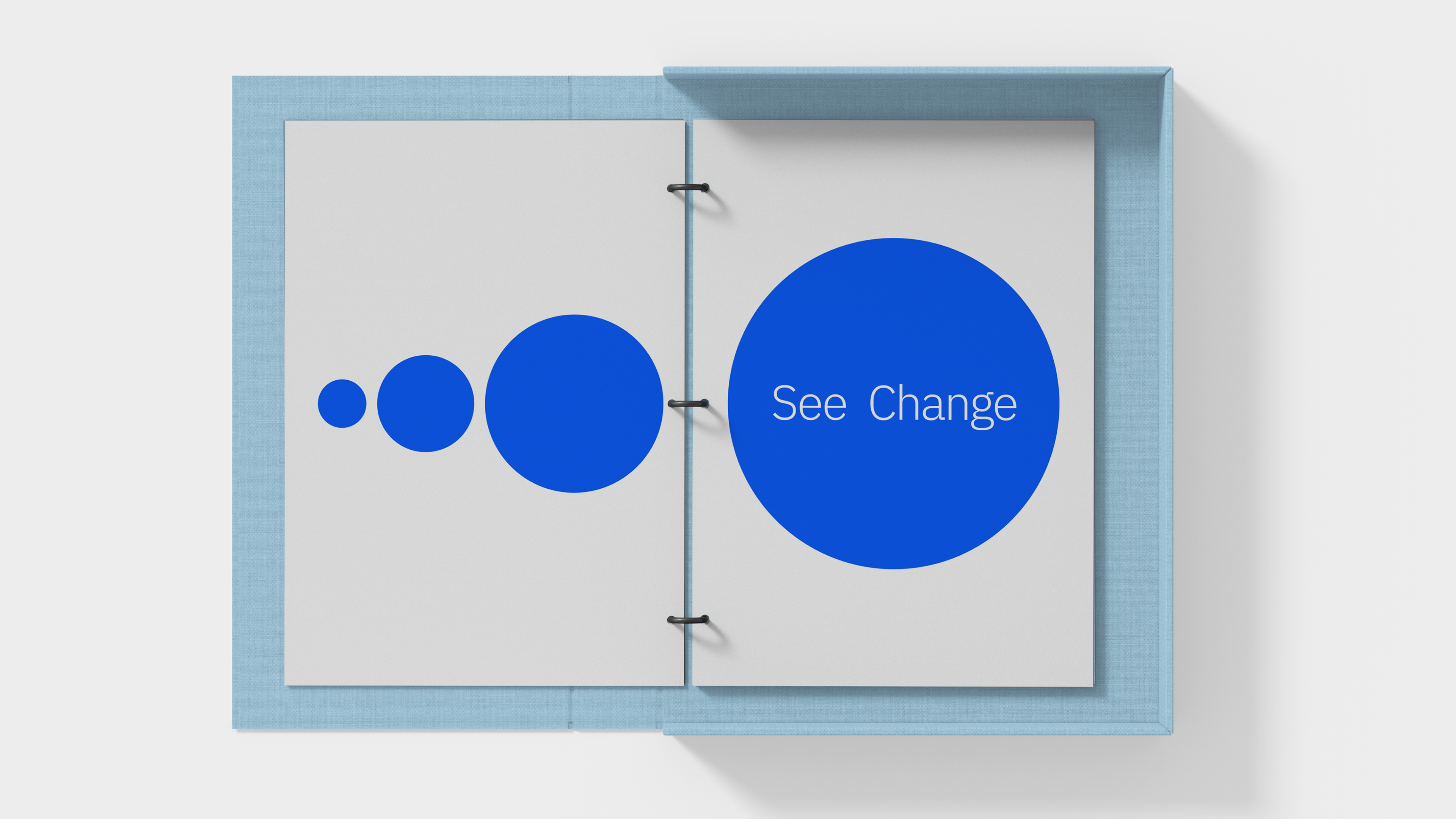
We dubbed this direction “Sea Change” as a double allusion to both IBM's belief in being the catalyst for transformative shifts in perspective, and to the idea that to make effective change, you need the data and insights to know where and how to apply effort for maximum effect.
With our strategic foundation solidified, our focus turned toward expressing this POV as an extension of IBM’s visual identity.

An Identity, Not a Logo
While it’s usually imperative to imagine something new when defining a visual identity, Sustainability didn’t demand the creation of a new mark or a kit of parts. The ask was to elaborate on what was already there, and find power and relevance through subtraction.
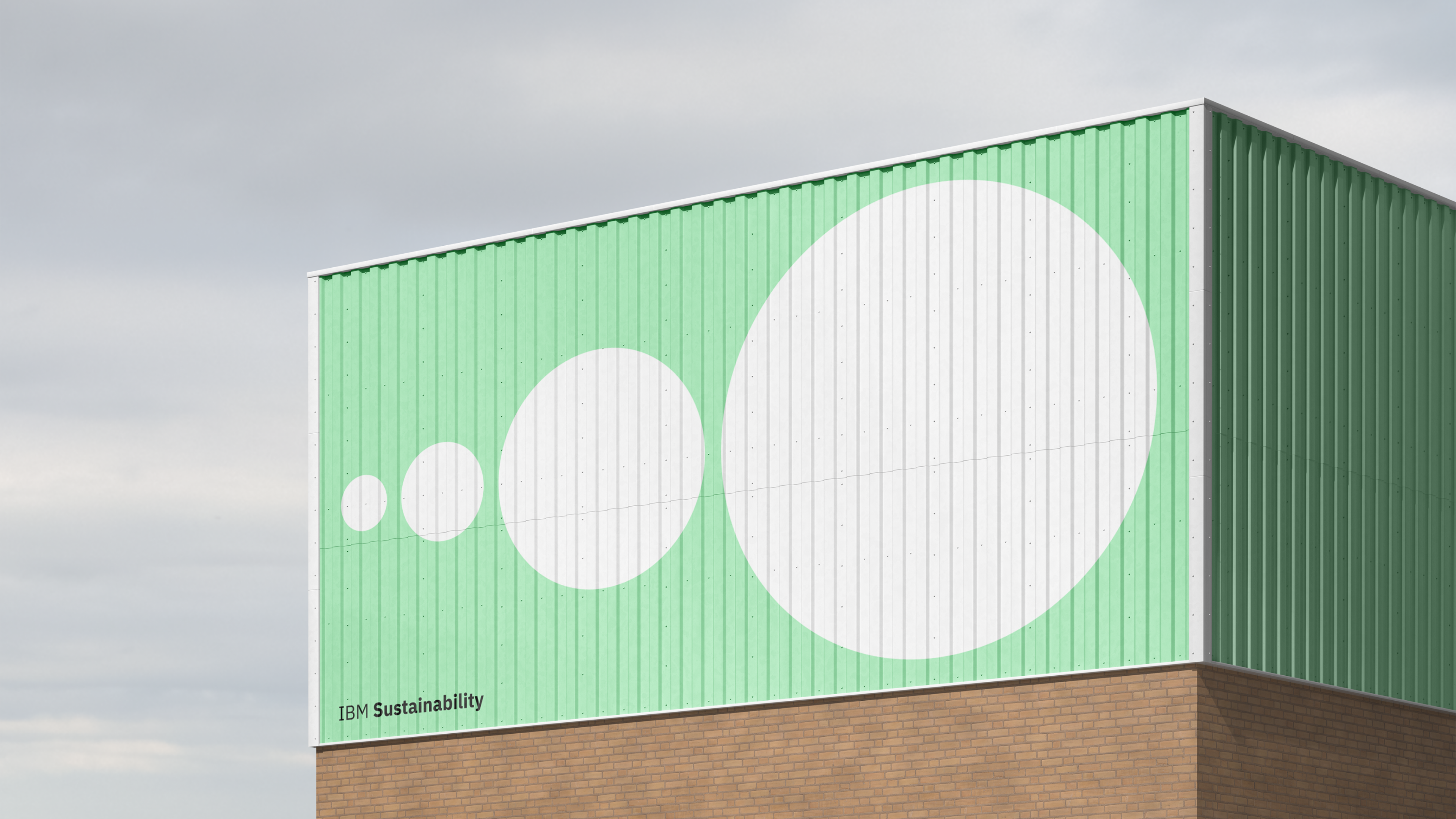
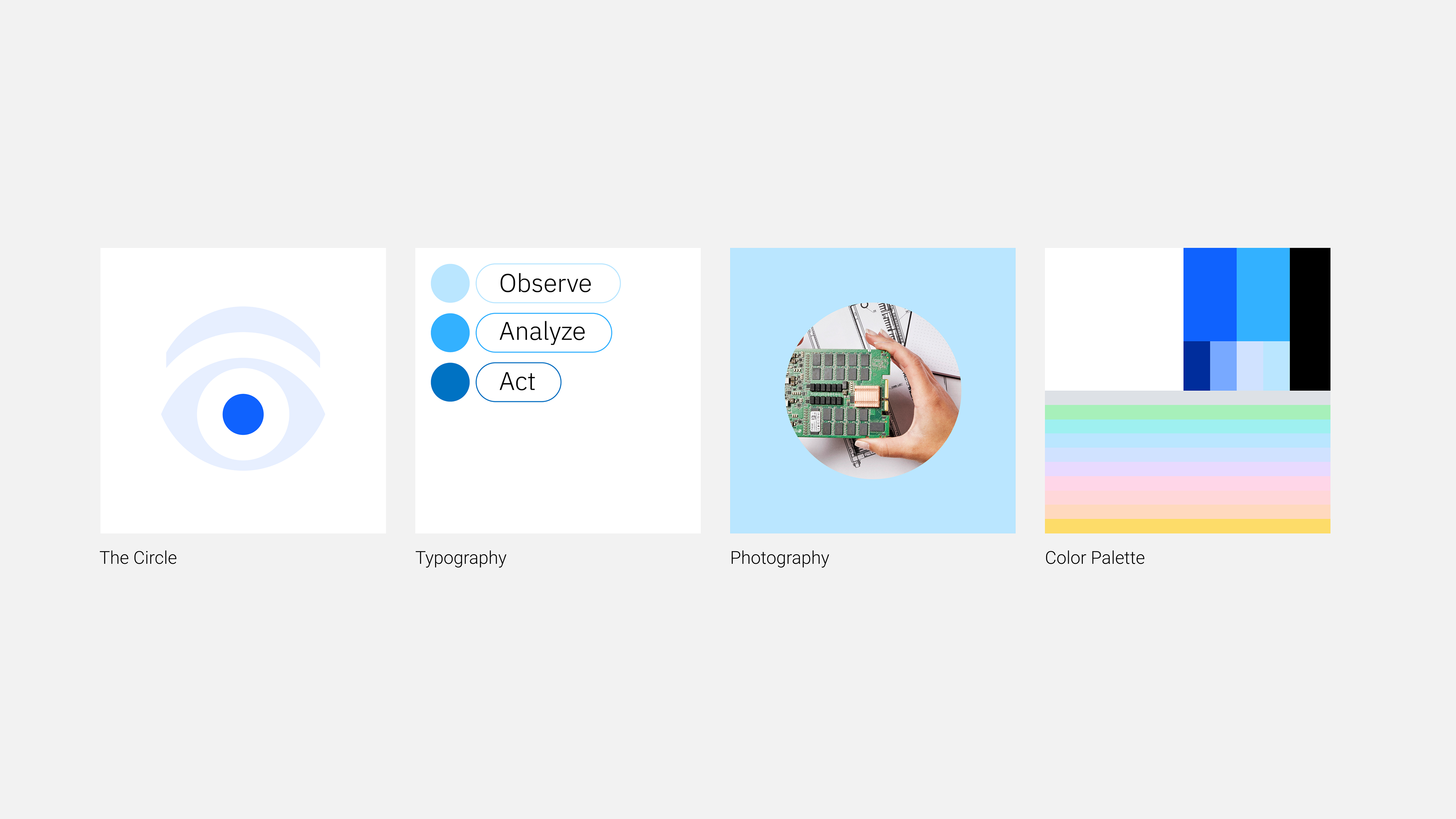
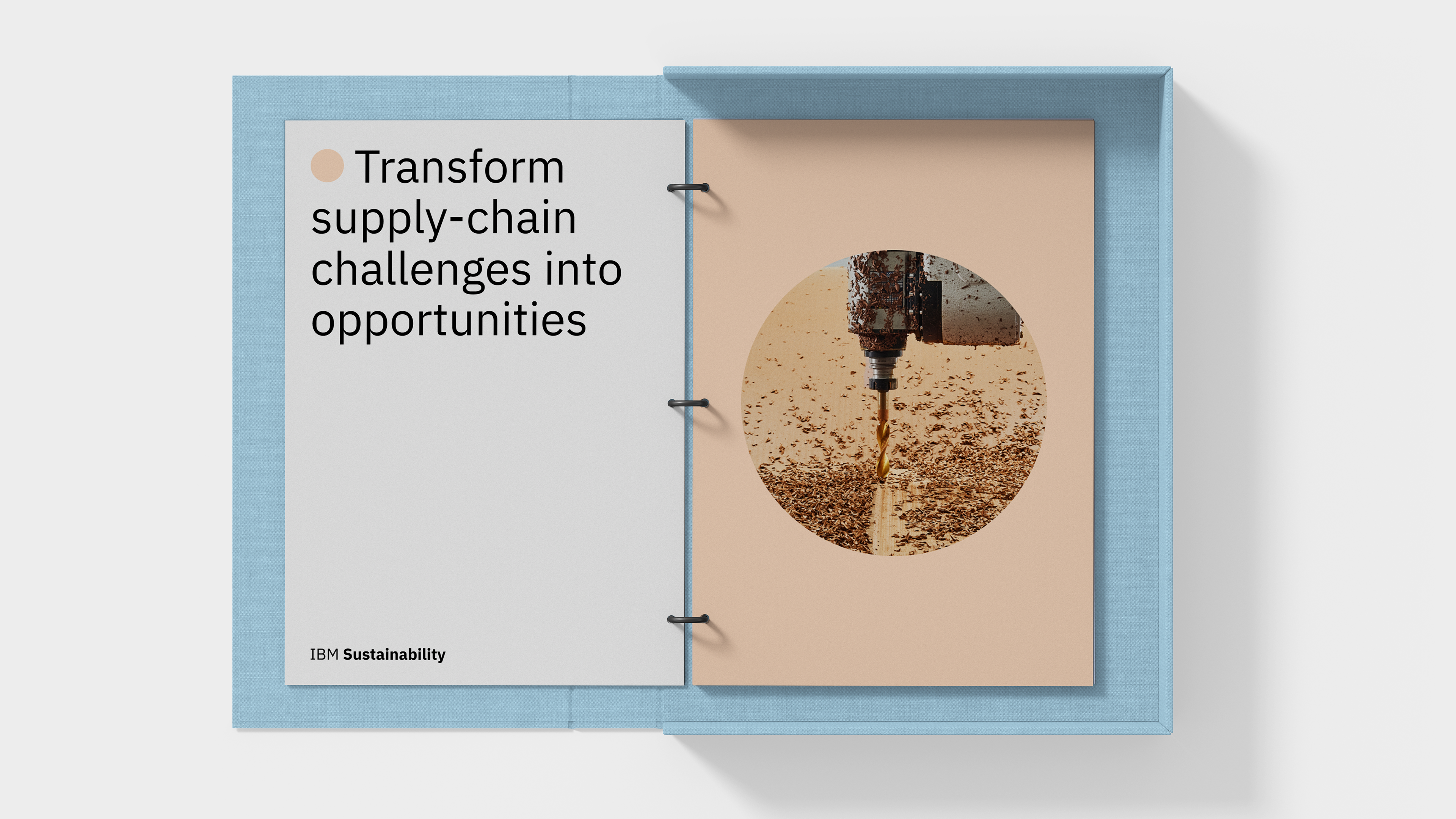
Stripping away pieces of what already existed within the IBM ecosystem, we arrived at a singular, universal element of IBM’s visual language as our unit of expression: the circle.
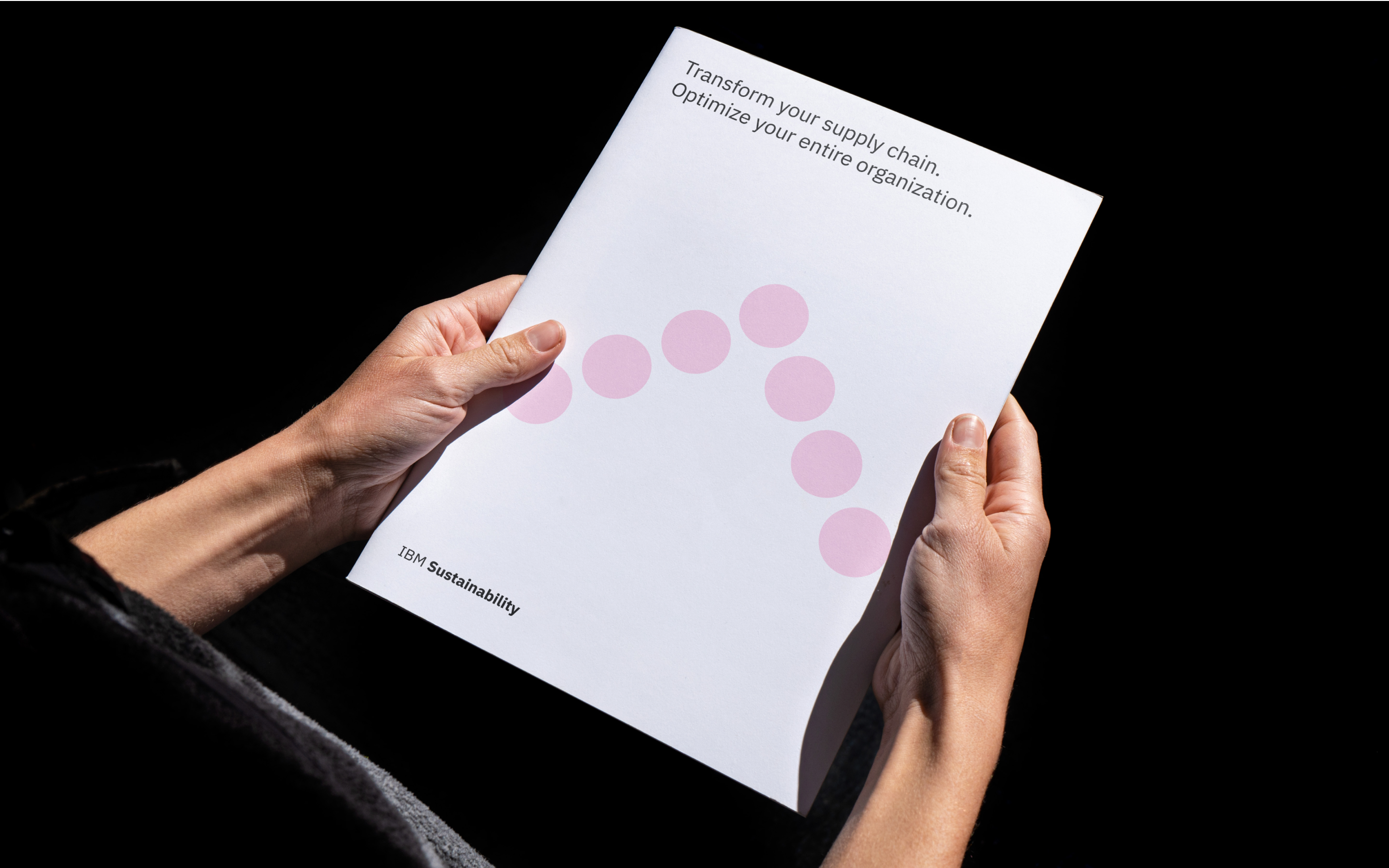
Although the circle is fundamentally a primitive shape, that is also its strength . Its ubiquity gave us the opportunity to create a visual association with sustainability that functioned retroactively, bringing a significance and meaning to material that predates the creation of the visual identity itself.


Visual, Verbal
Exploring the circle took many exciting forms, with a strong focus on macro-to-micro relationships.
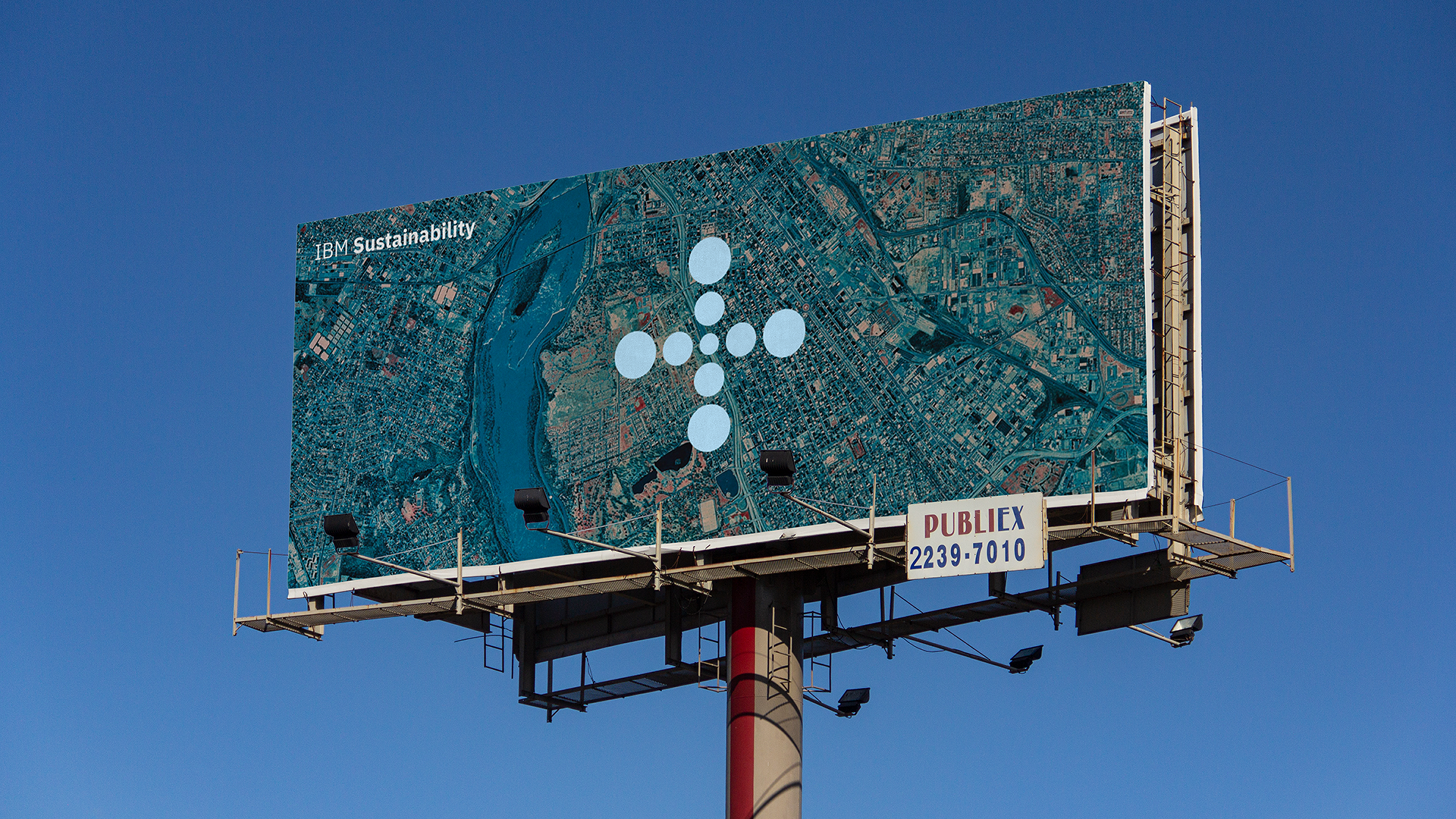
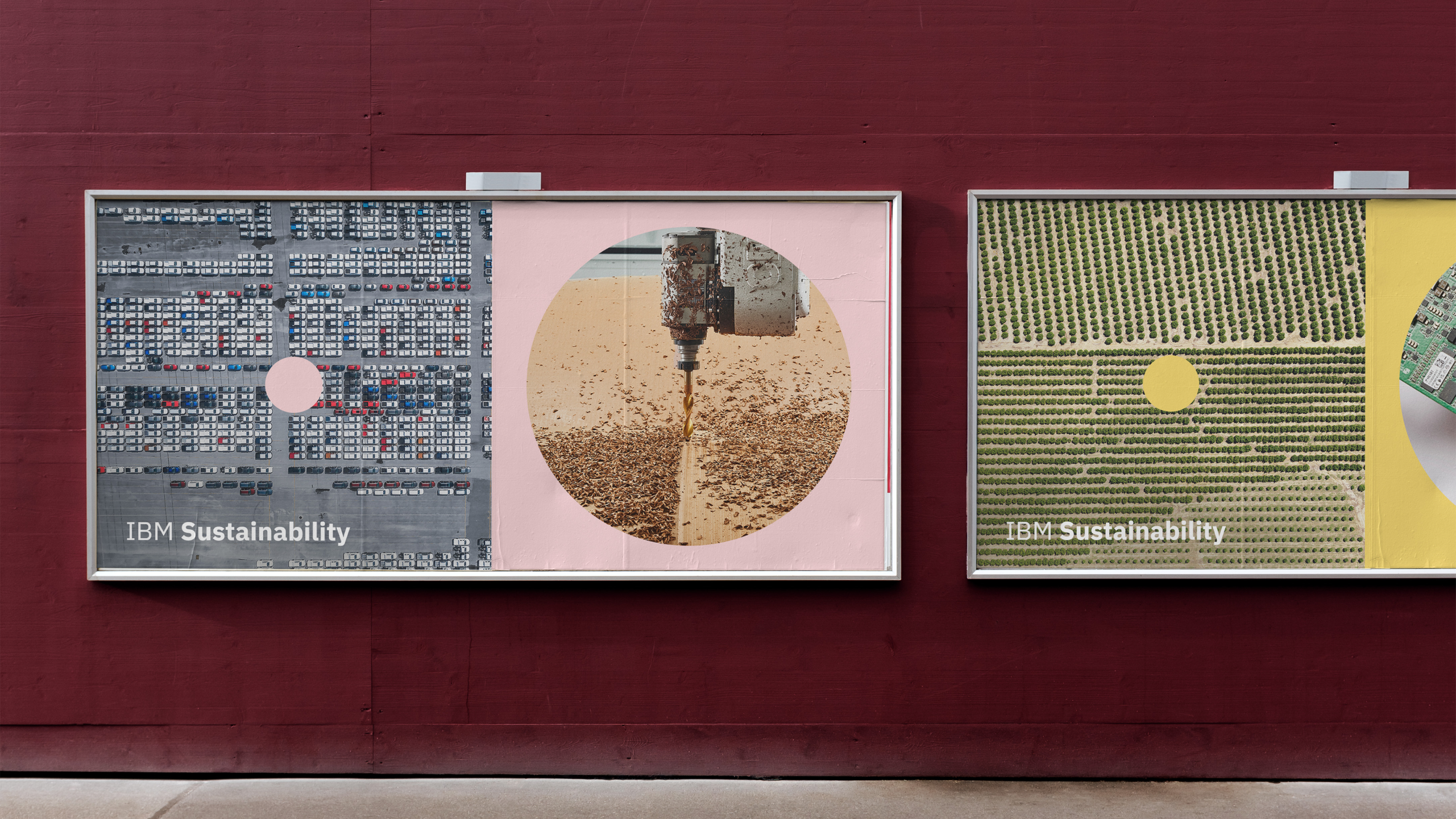
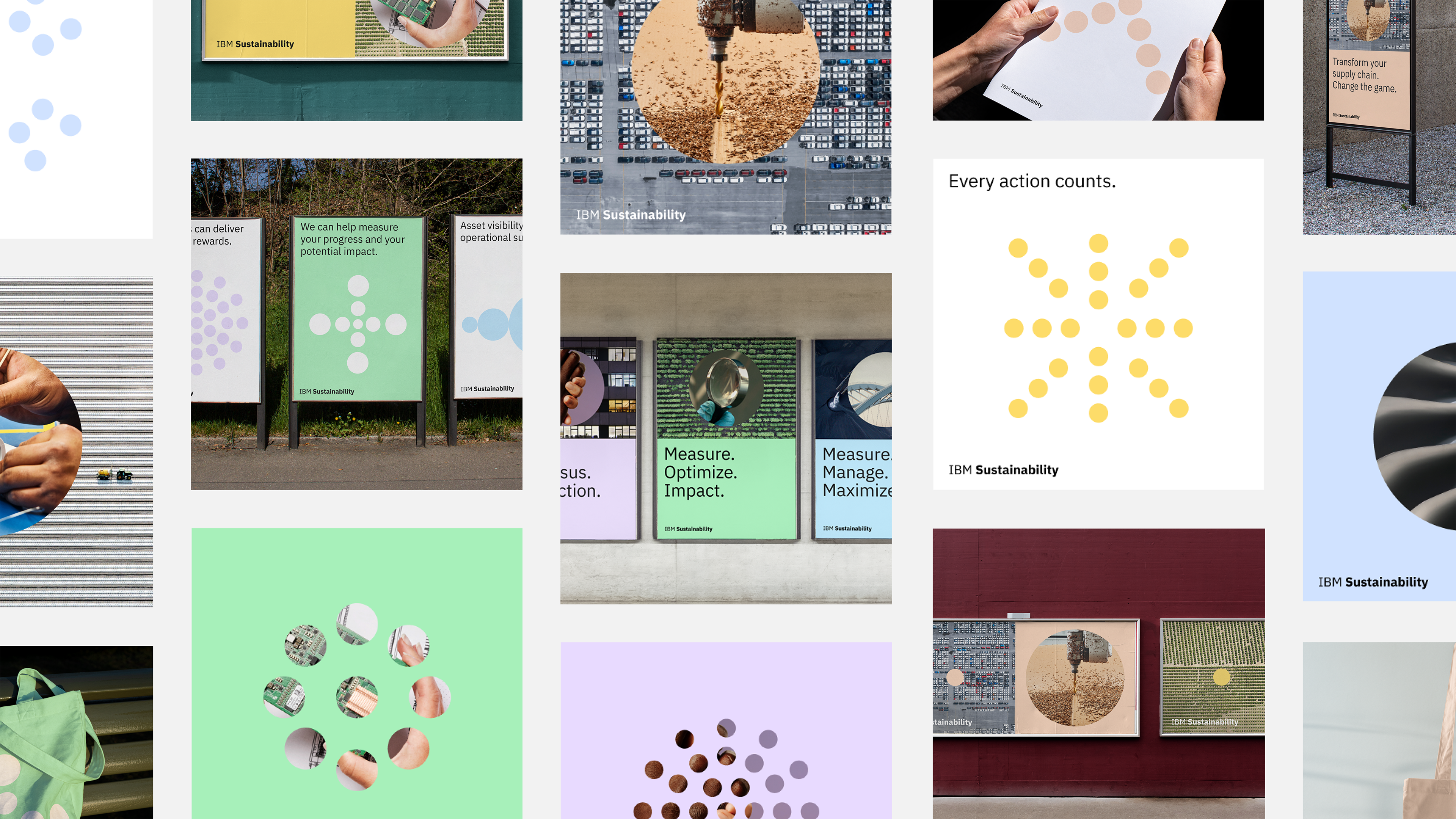
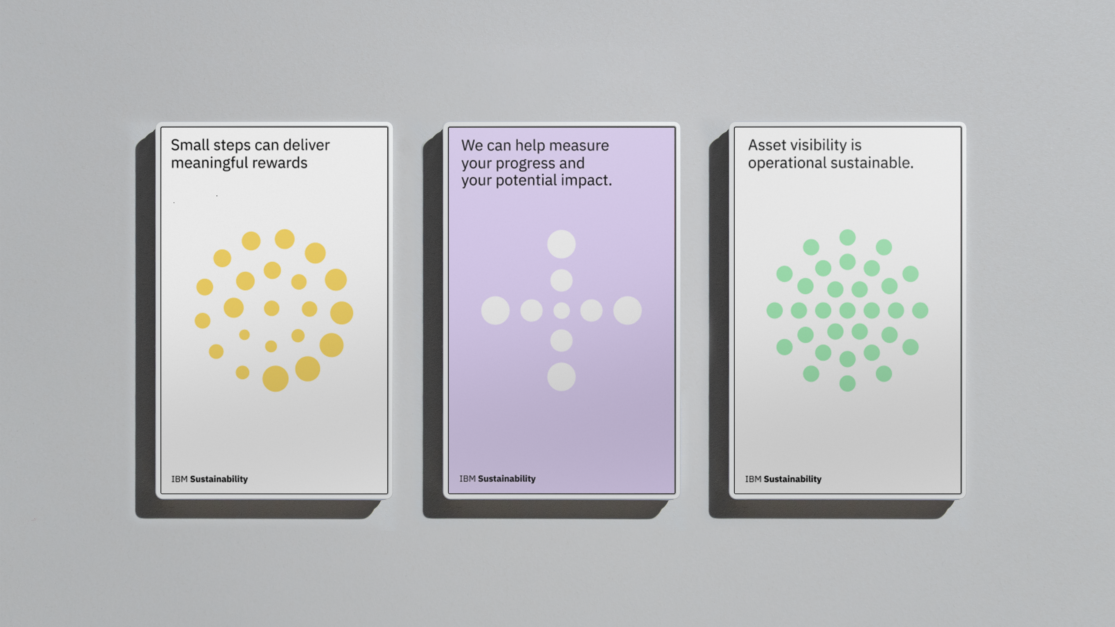
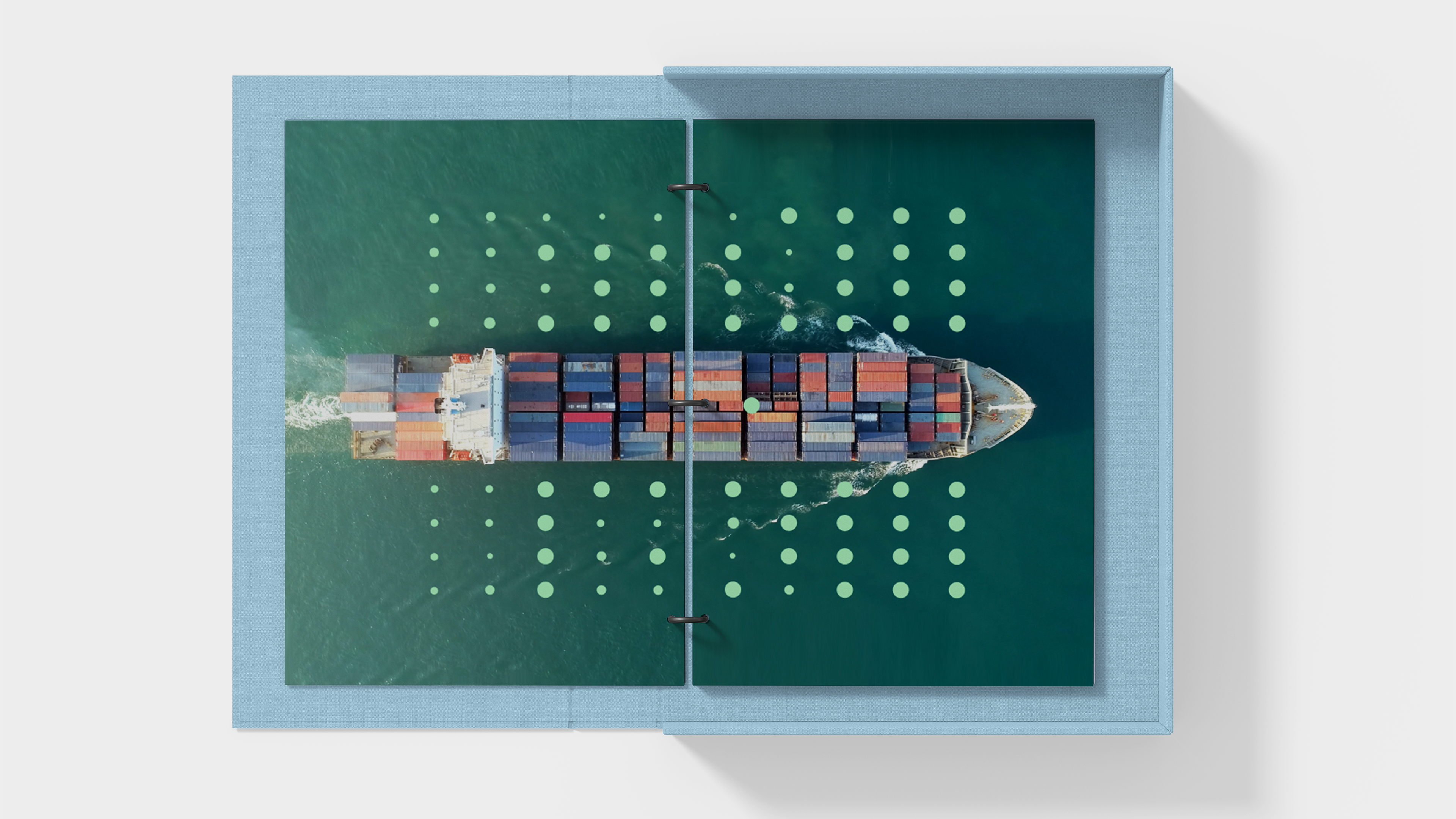
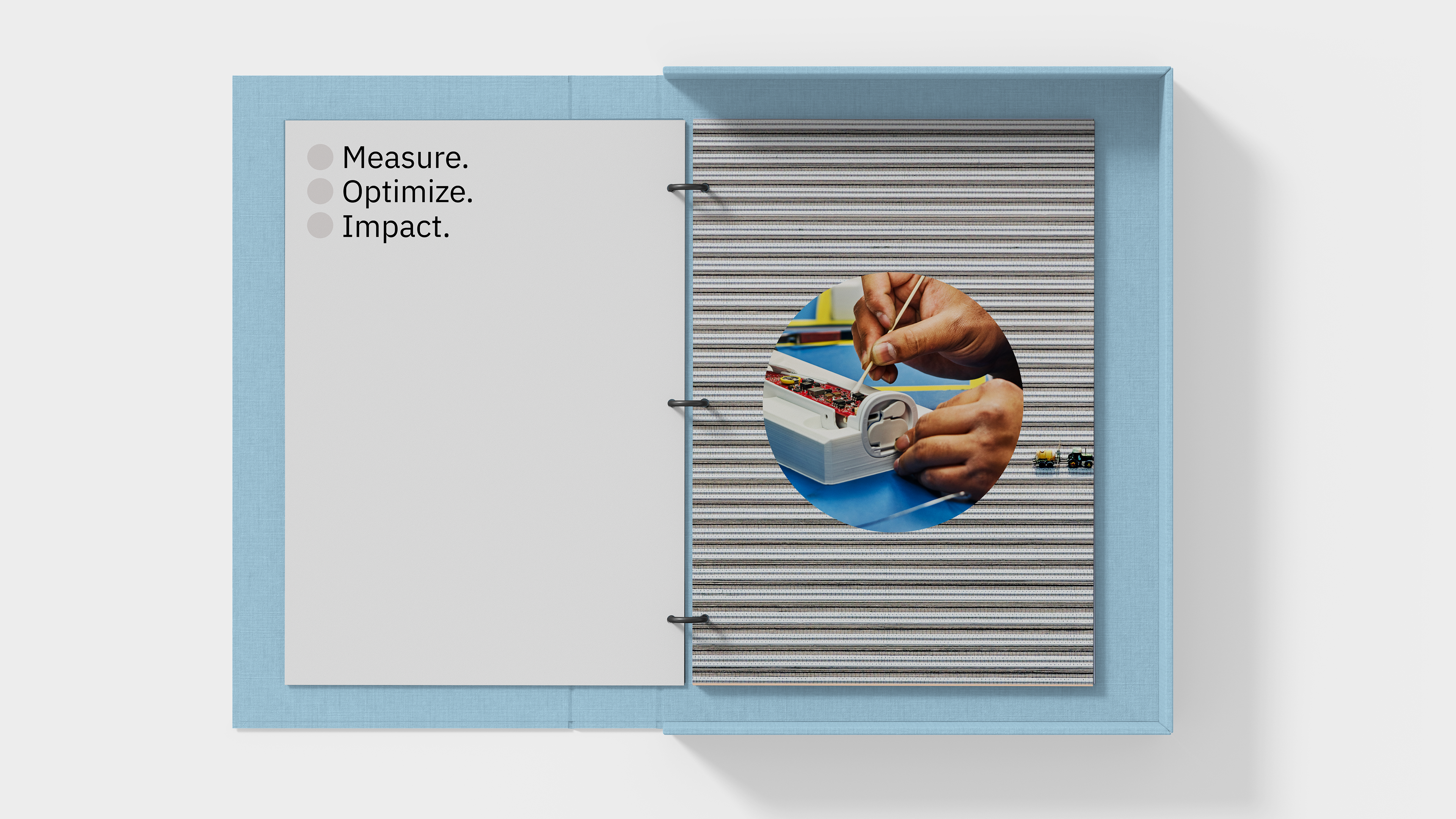
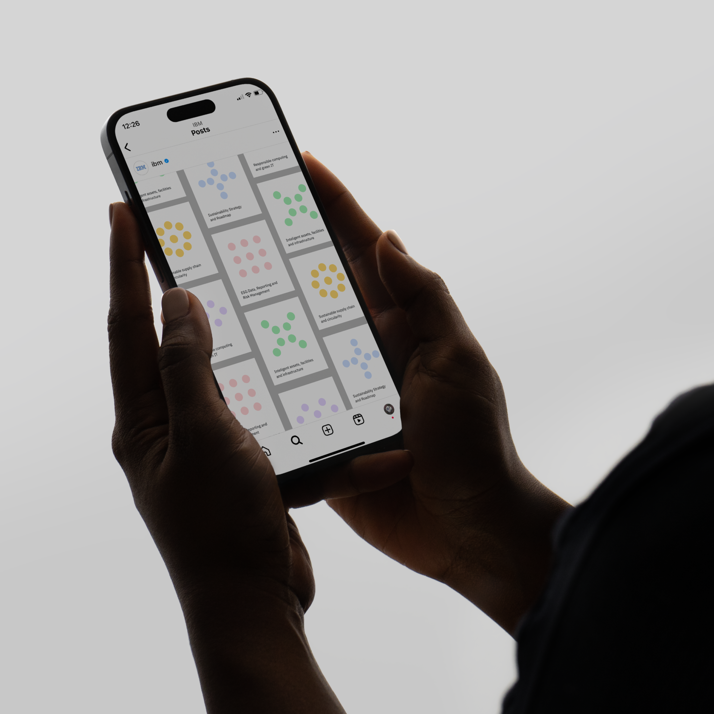
Singular circles highlight, reveal, and bring focus — delicately pairing with typography as a subtle means of creating emphasis. In multiple instances, the circle both evokes and depicts data, and plays different roles as minimalist illustrations: one to one, one to many, everything at once.
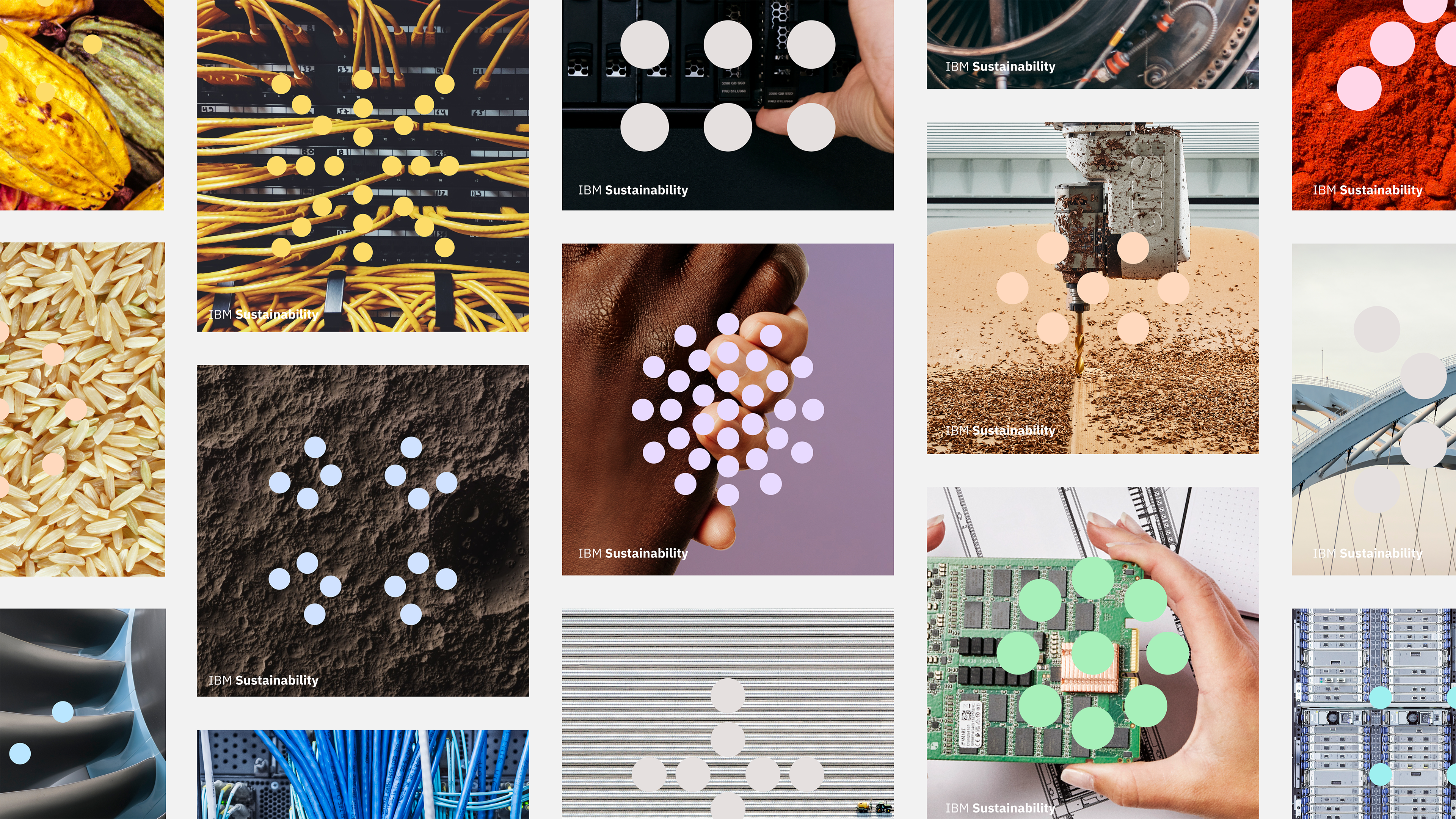
These visual relationships were strengthened with a sympathetic color palette from the core IBM palette, finely art-directed photography pairings, and rigorously crafted infographic–inspired symbols.
Hand-in-hand with the visual identity is a verbal one: a specific tone of voice and approach that we defined as Enthusiastic Pragmatism. Inspired and inviting, functional and factual. Sustainability communications also inherit an ‘A to B’ approach toward relationships between actions and outcomes —‘Micro to Macro’ remaining the gold standard example of this technique.

Dot Dot Dot
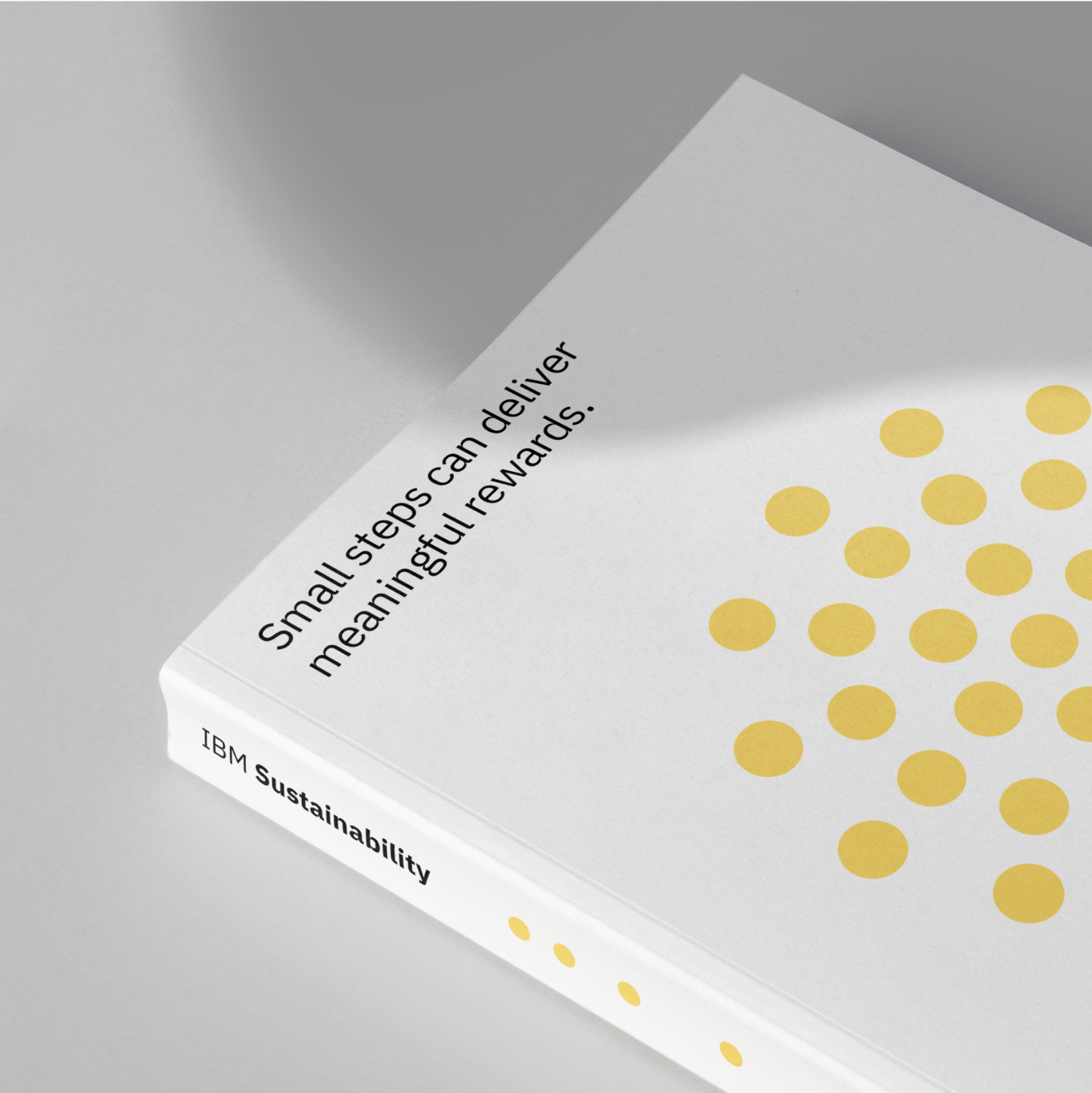
The outcome is an identity that is subtly distinct from the core IBM brand, but made of it and for it. It’s an expression that can stand on its own to visually and verbally communicate a specific sustainability POV, while also permeating into every facet of where, how, and why IBM communicates.

Group Creative Director Jon Gorman
Creative Director Shannon Jager
Art Director Abbie Winters, Han Gao
Designer Daniel Stuhlpfarrer, Margaux Saulou, Lucas Ramos, James Rivas
Executive Producer Kim Stephens
Producer Bess Howell, Alex Decaneas
Strategy Lead Surabhi Rathi
Brand Strategist Scott Sparks, Madison Caprara, Copywriting, Josephine Heintz, Charlie Short
Special Thanks Will Burkart, Marla Moore, Camille Chu, David Evans, IBM Sustainability Hero Video
Group Creative Director Jon Gorman
Creative Director Joyce N. Ho, Shannon Jager
Executive Producer Kitty Dillard
Producer Alex Decaneas
Art Director Diego Morales
Production Coordinator Dani Ortega
Strategy Director Surabhi Rathi
Copywriter Charlie Short, Josephine Heintz
Designer Margaux Saulou, Rafael Bessa
2D Animation Lead Alex Perry
2D Animator (AE) Gilles Desmadrille, Meitar Almog, Morgan Allison, Nicole Pappas
Compositor Melissa van het Spijker
Post Supervisor Jose Fuentes
Editor Cameron Kelly, Dave Conte