Milk Supply | 18 Things Zine
- Project
- Editorial Design
- Role
- Art Director
- Client
- Milk Supply
- Year
- 2021
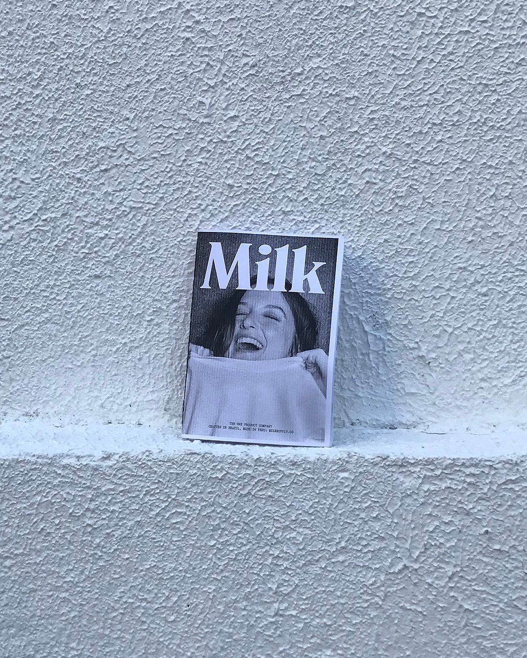
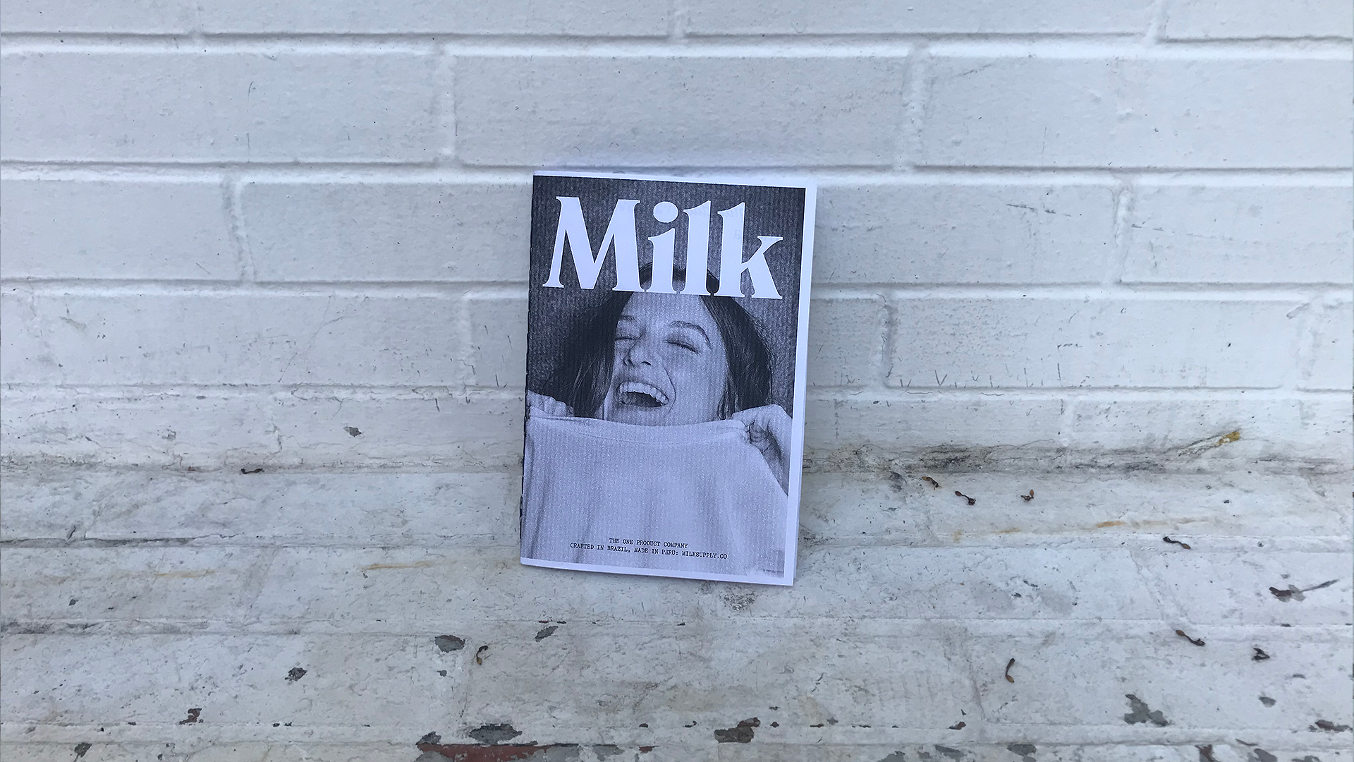
Milk Supply is a minimalist design studio created to reimagine people's relationship with the essentials.
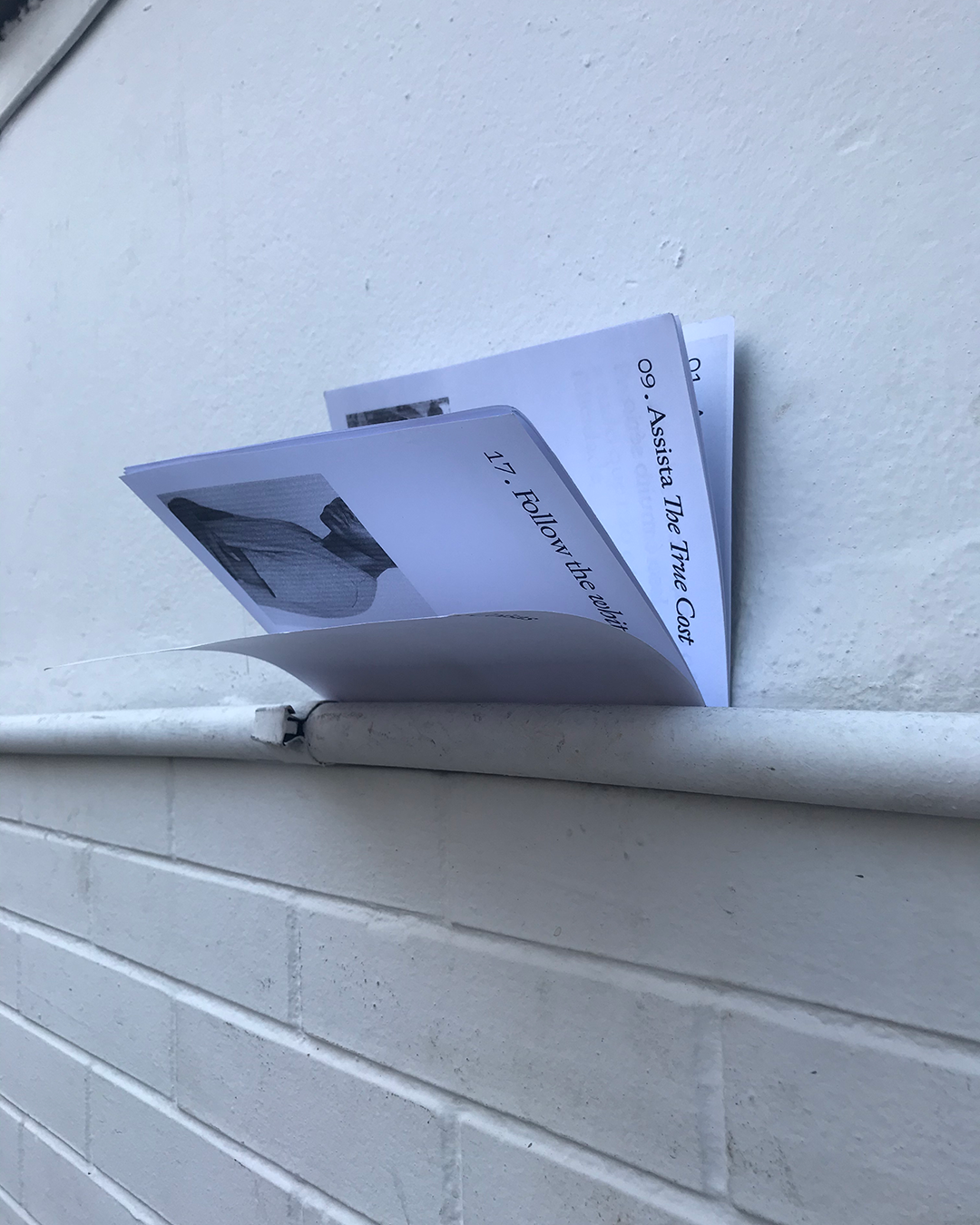
The brand only offers one product: the best t-shirt ever made for the human body. And to communicate better with their consumers, there was an urgency to translate it's aims in a visually-engaging instagram profile that connected on and offline world in a milky perspective.
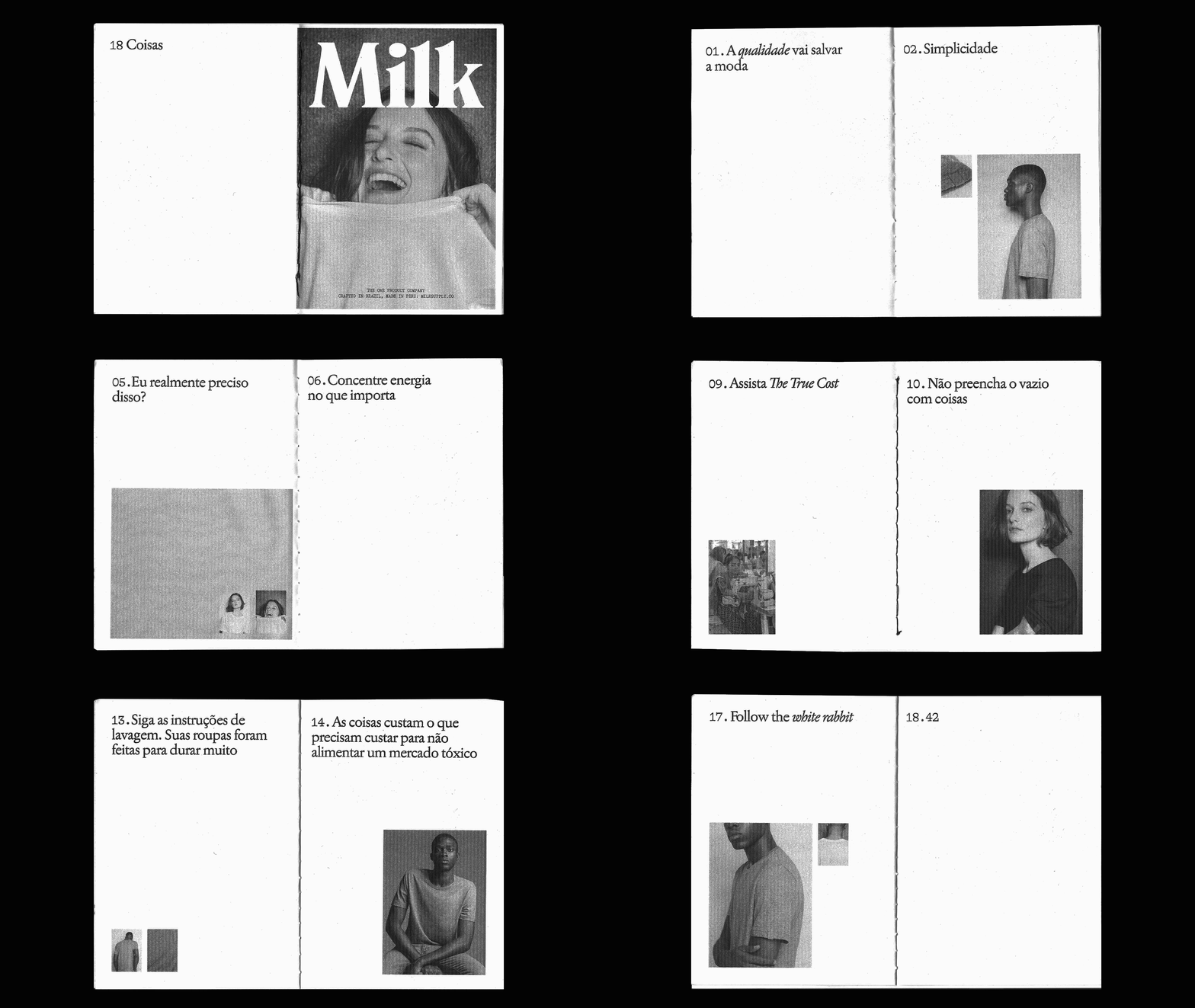
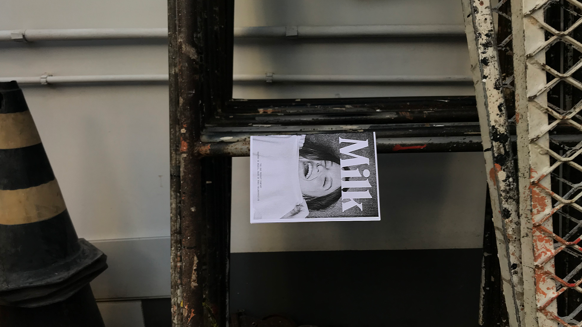
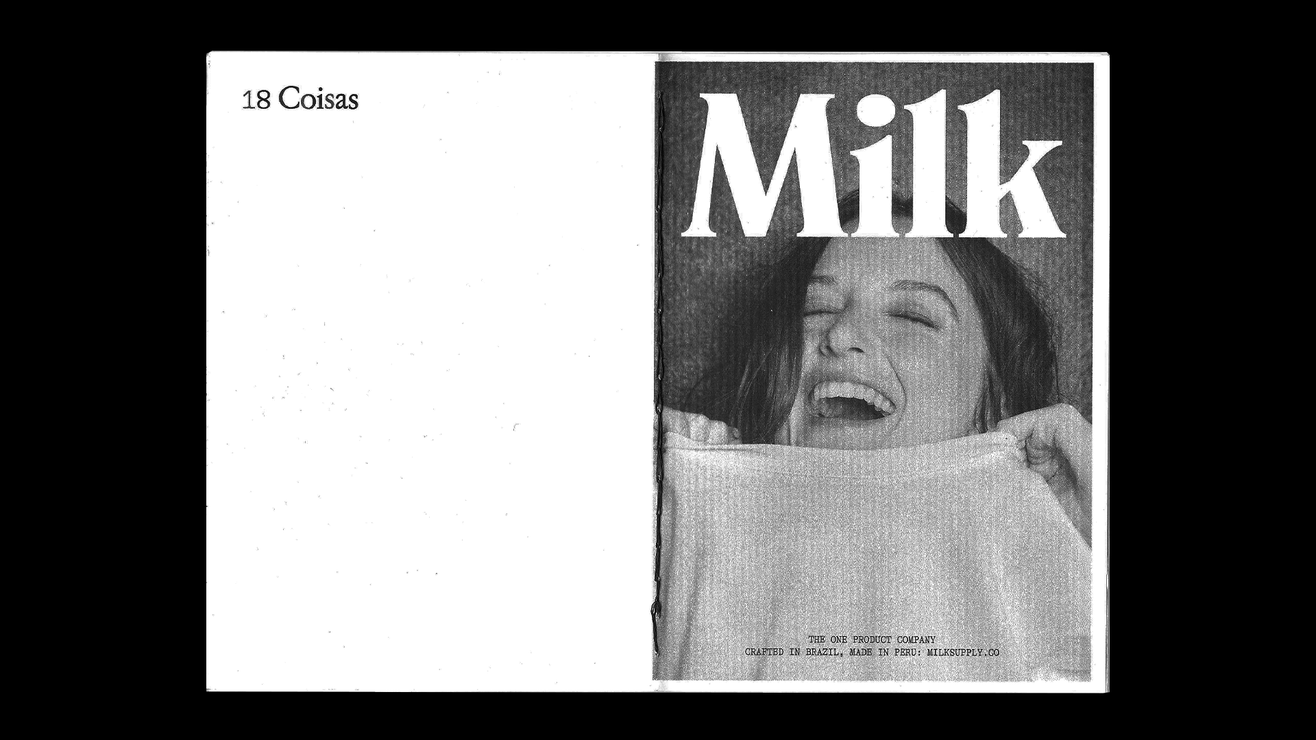
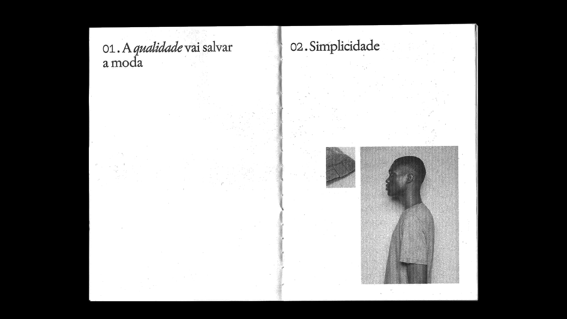
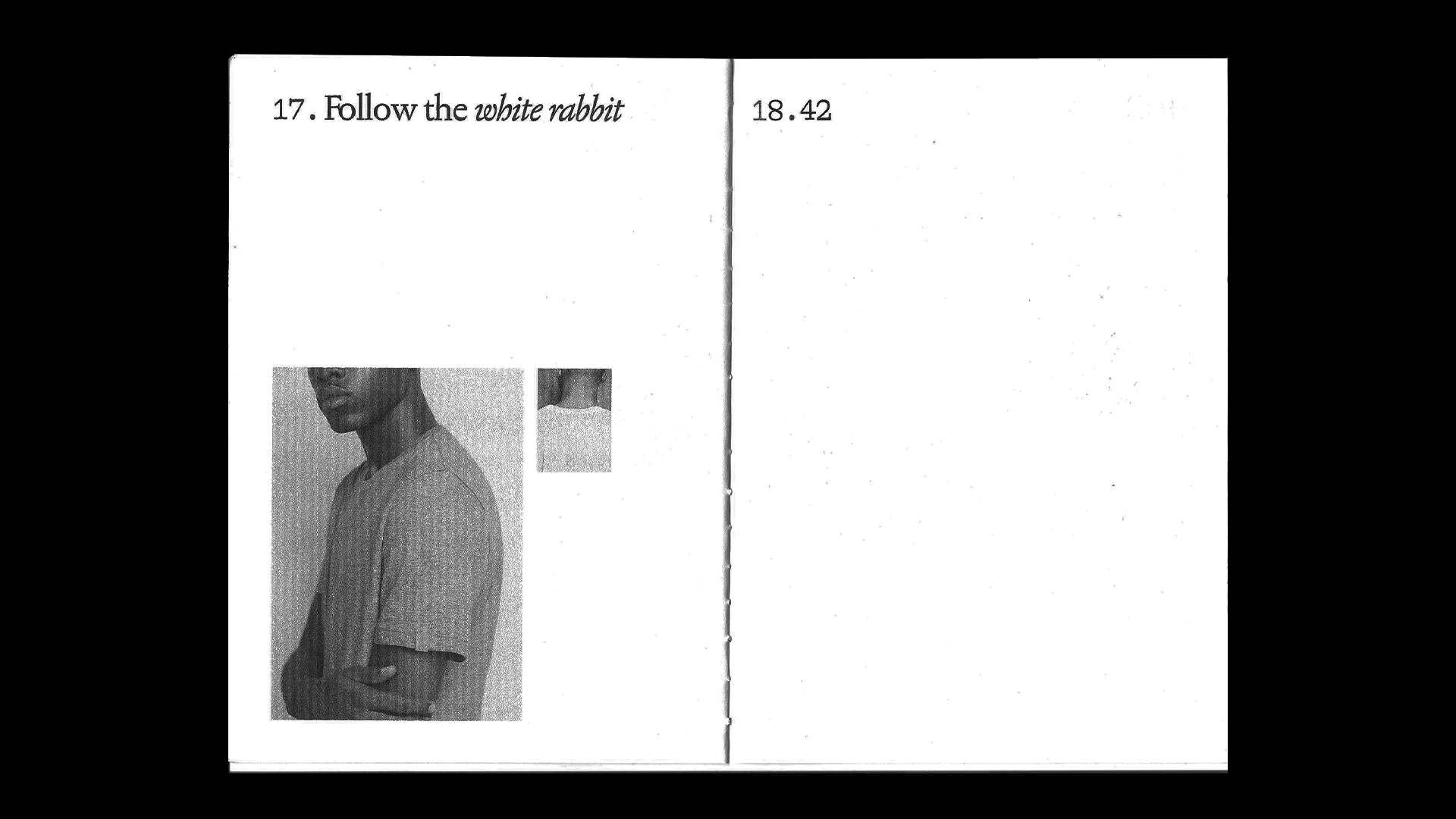
The primary typeface was Jannon, used for body copy. Alpina Typewriter served as the secondary typeface for numerals.

Like the broader project, the grid was based on Milk Supply's brand identity, using a five-column subdivision and a 5 mm bleed for offset printing.
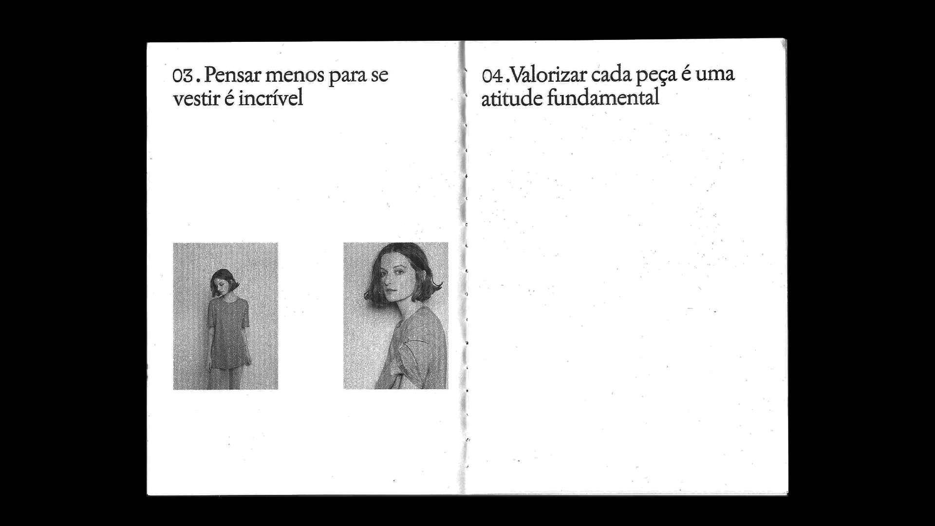
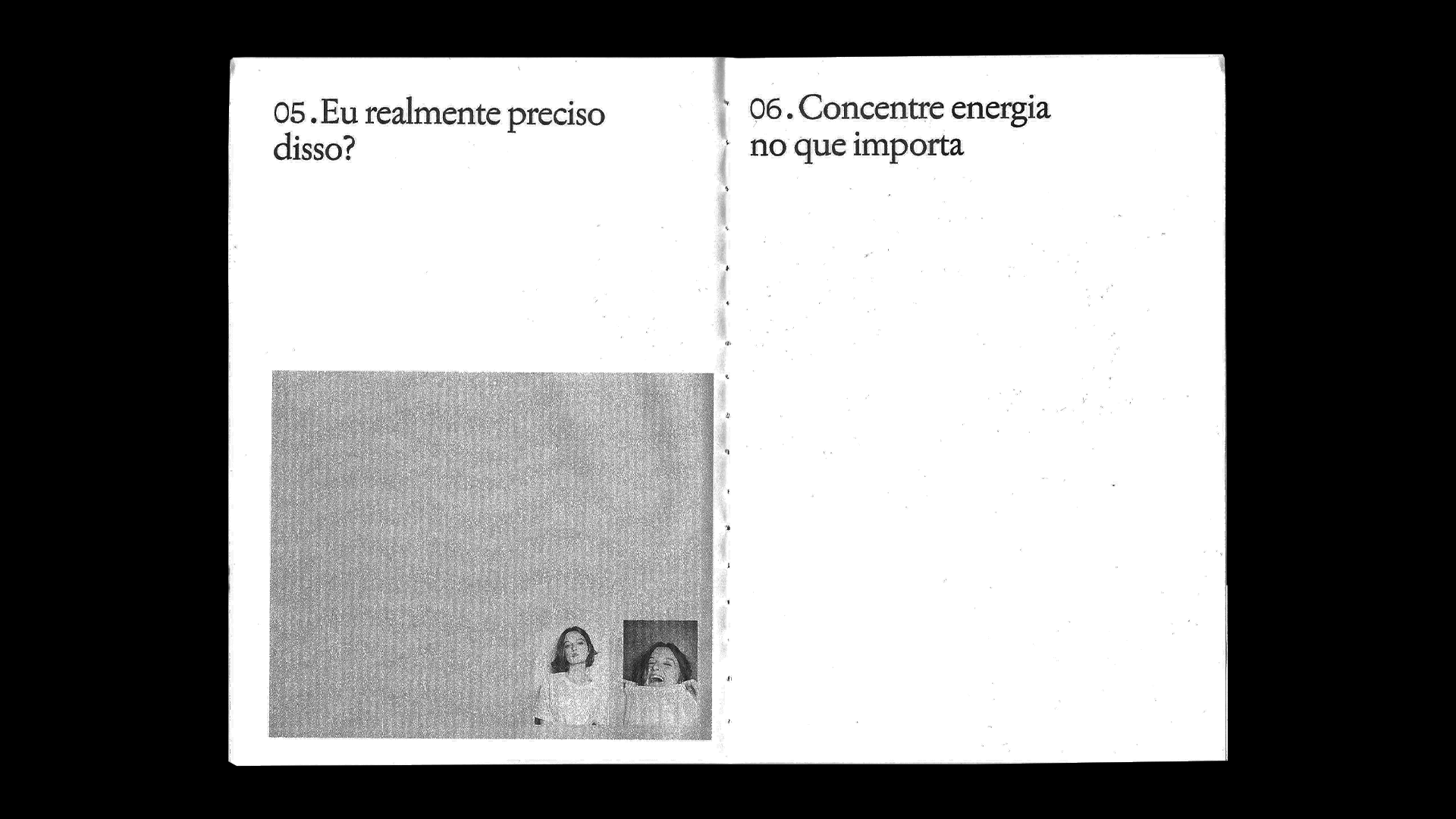
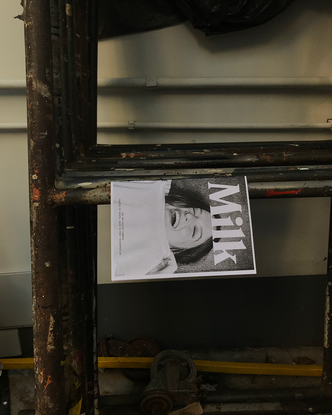
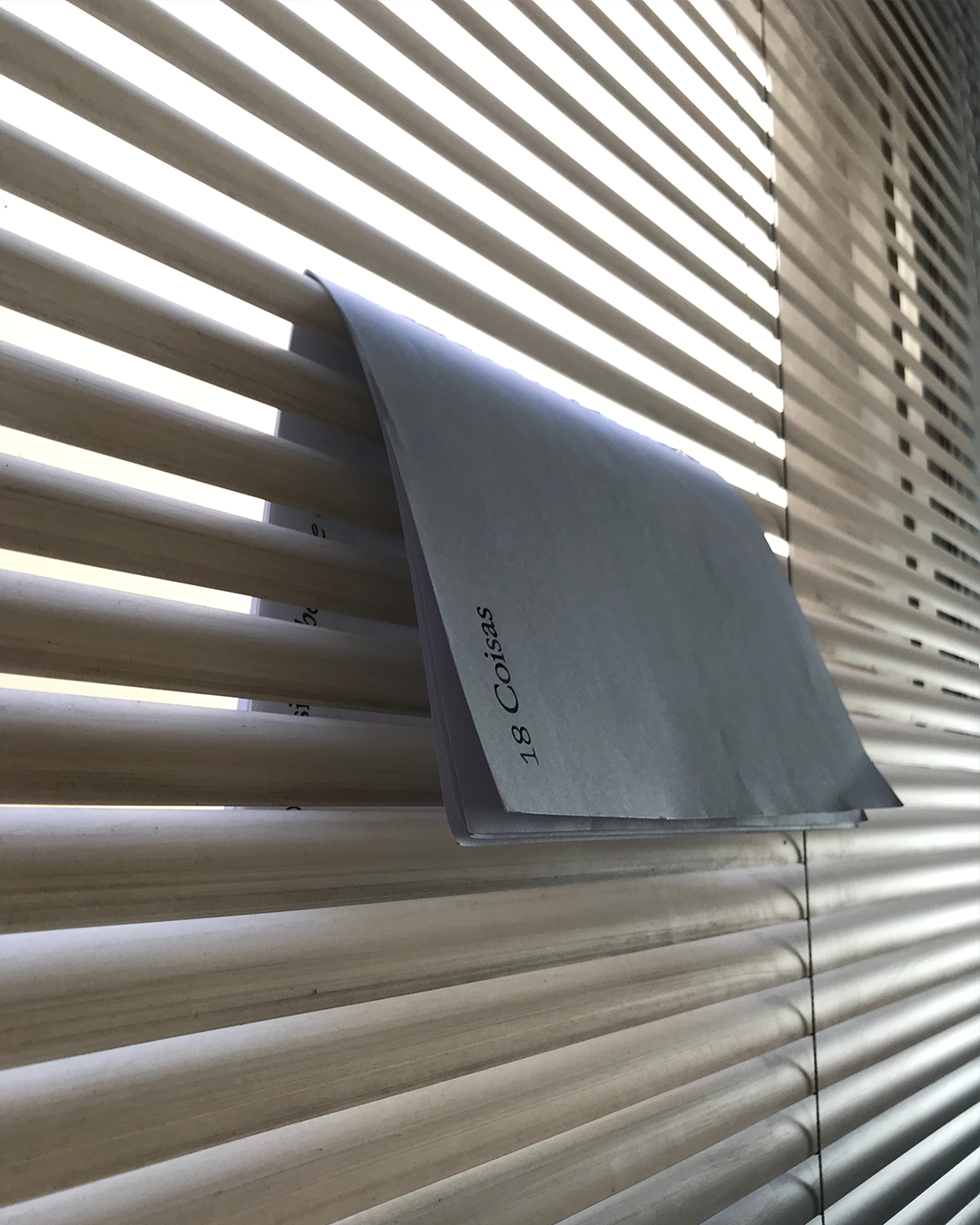
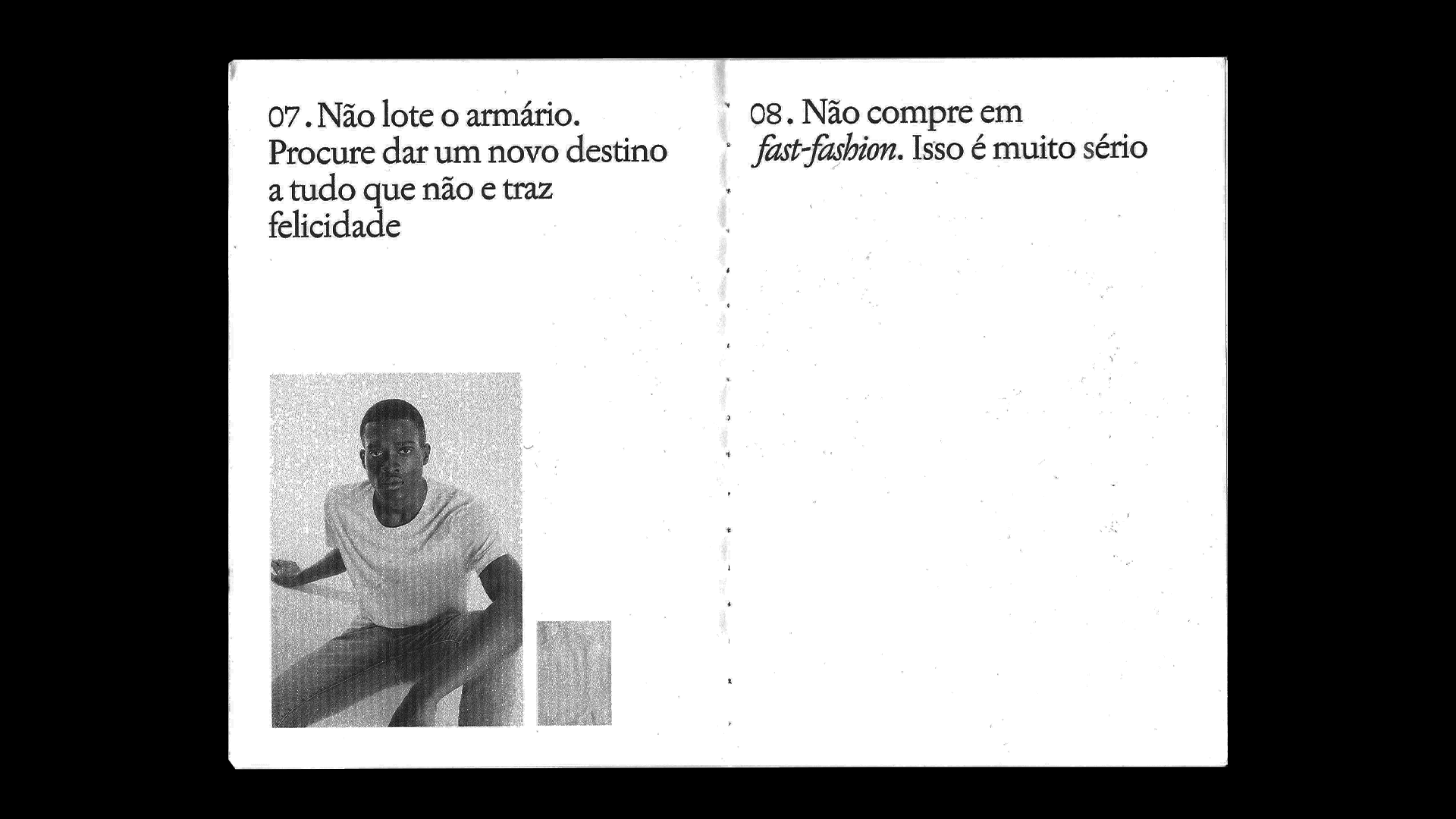
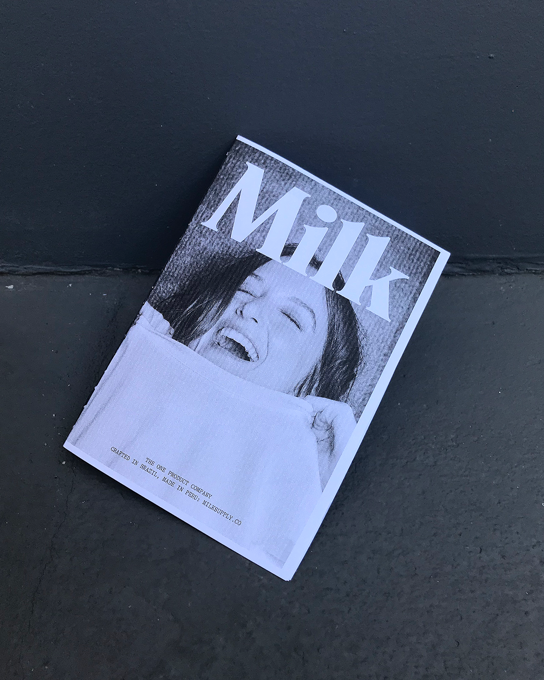
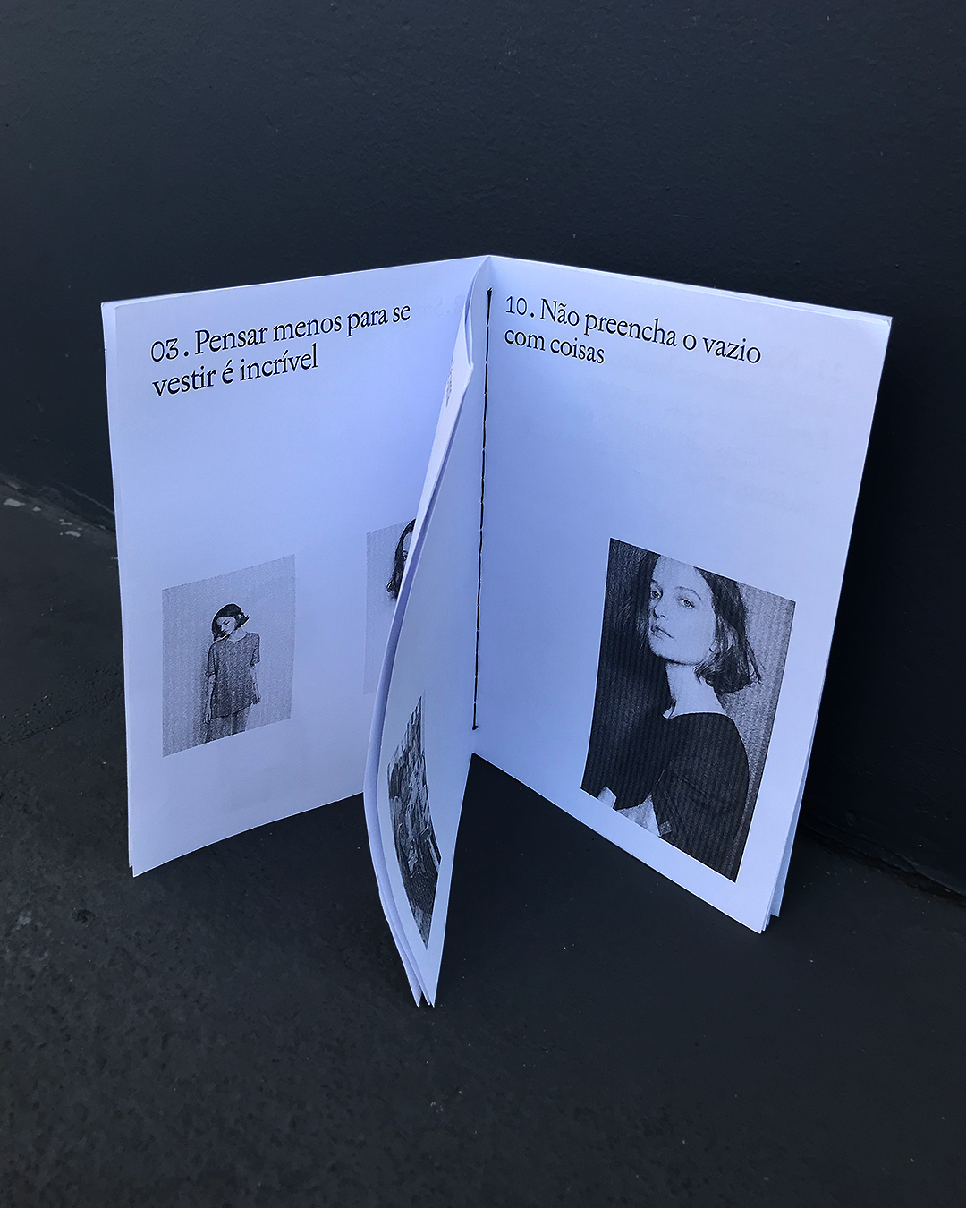
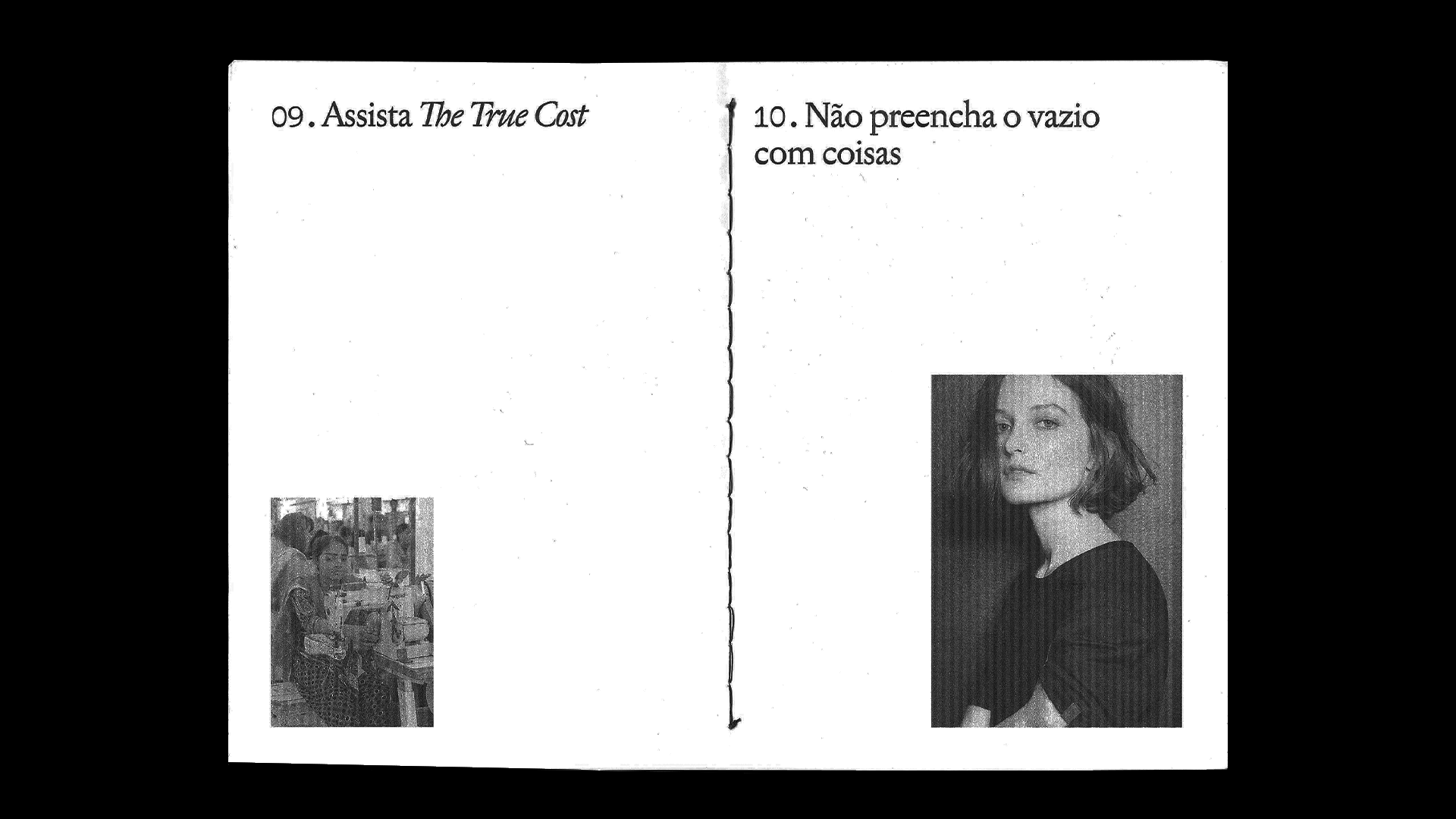
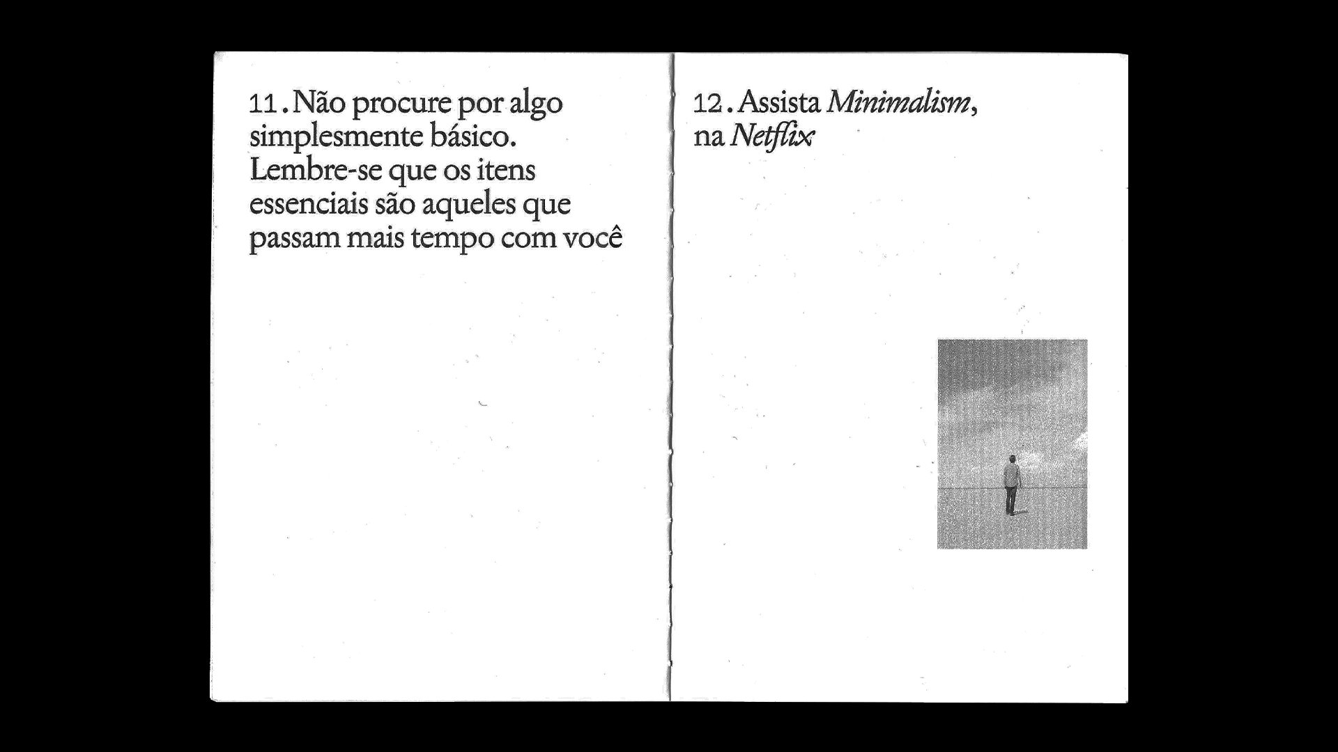
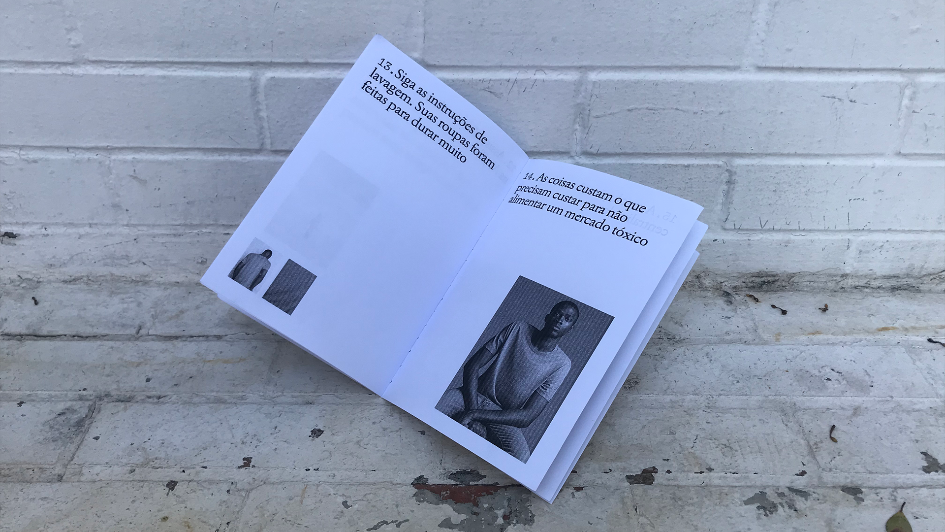
The photos were shot in a studio in Santa Cecília, São Paulo, Brazil.
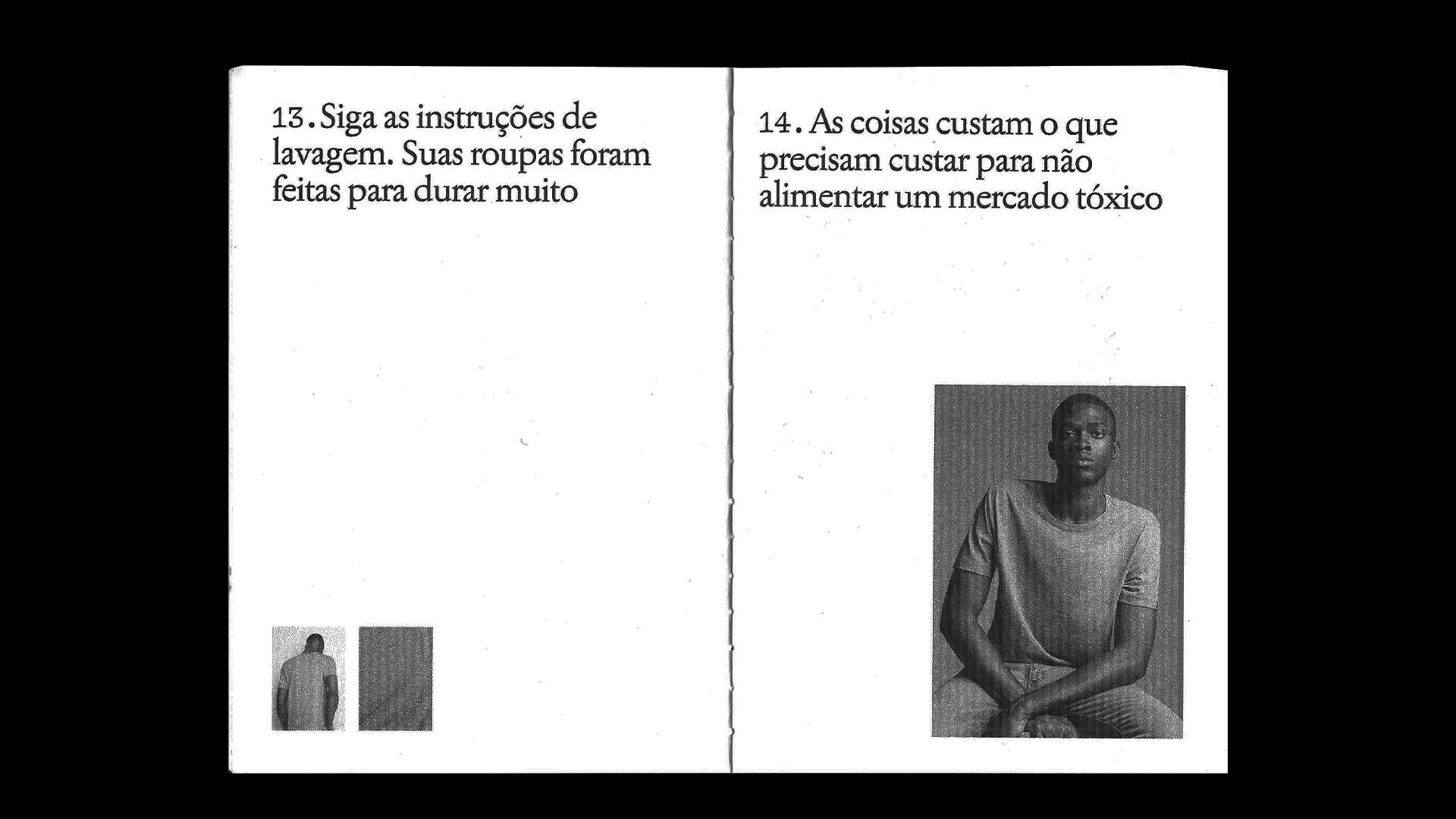
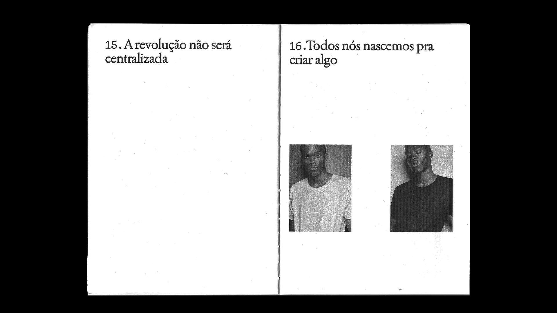
Art Director: Lucas Ramos
Copywriter: Caio Milanesi
Approved by: Rafael Caldeira and Gui Caldeira
Brand Identity: Porto Rocha