An ongoing collection of poster experiments exploring custom lettering, illustration, and composition. Early studies respond to Blank Poster's word prompts, while later pieces explore the visual world of Nice Studio and the live music of Felipe Sanches.
Each poster approaches the page differently: expressive letterforms, impossible architecture, characters shaped into type, and modular lettering. The collection brings these directions together through bold graphic forms and tactile textures.
Stereography Study (2025)
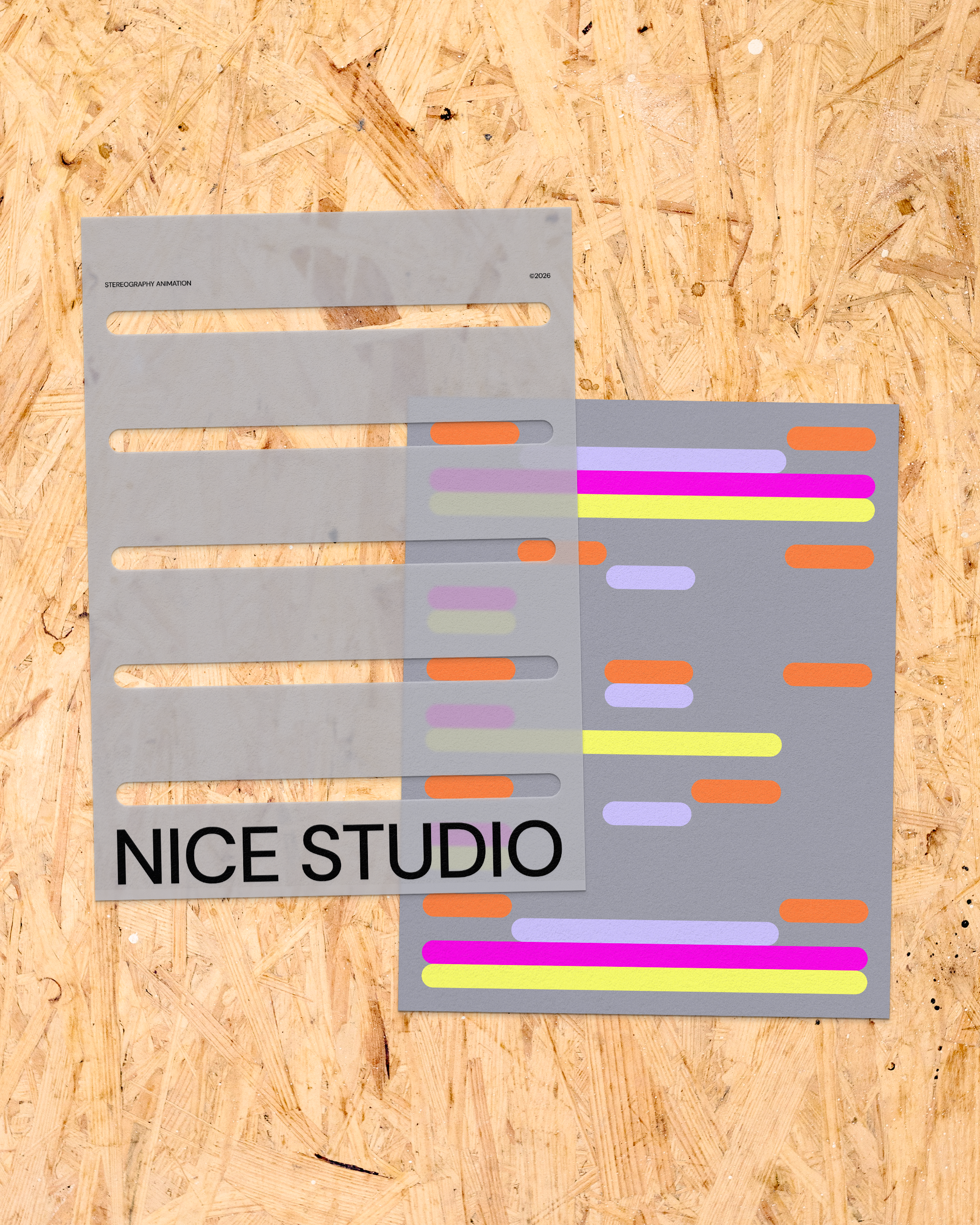
A personal poster study for Nice Studio, exploring a stereography-inspired technique. As a striped overlay slides across the composition, the letters appear individually, turning the act of reading into a short animated sequence.
Rounded bands of orange, lavender, magenta, and yellow establish a rhythm of color and repetition. The still image presents the overlapping layers, while the animation shows how movement reveals the typography.
Felipe Sanches: Year-End Show (2025)
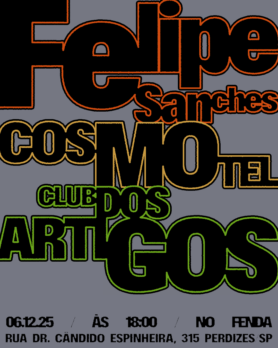
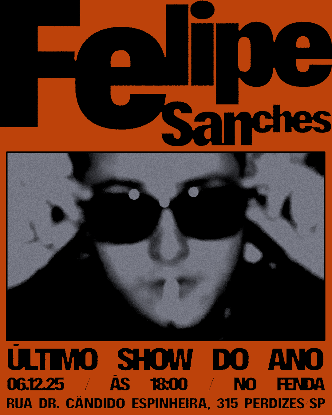
Two posters for Felipe Sanches' final show of the year at Fenda in São Paulo, sharing the bill with Cosmotel and Clube dos Artigos on December 6, 2025.
Oversized, tightly packed lettering gives the lineup a bold presence, with rough edges and contrasting outlines adding a raw, tactile quality. A second composition pairs the same typographic approach with a grainy black-and-white portrait and an orange background, keeping the artist at the center of the announcement.
Nice Studio (2025)
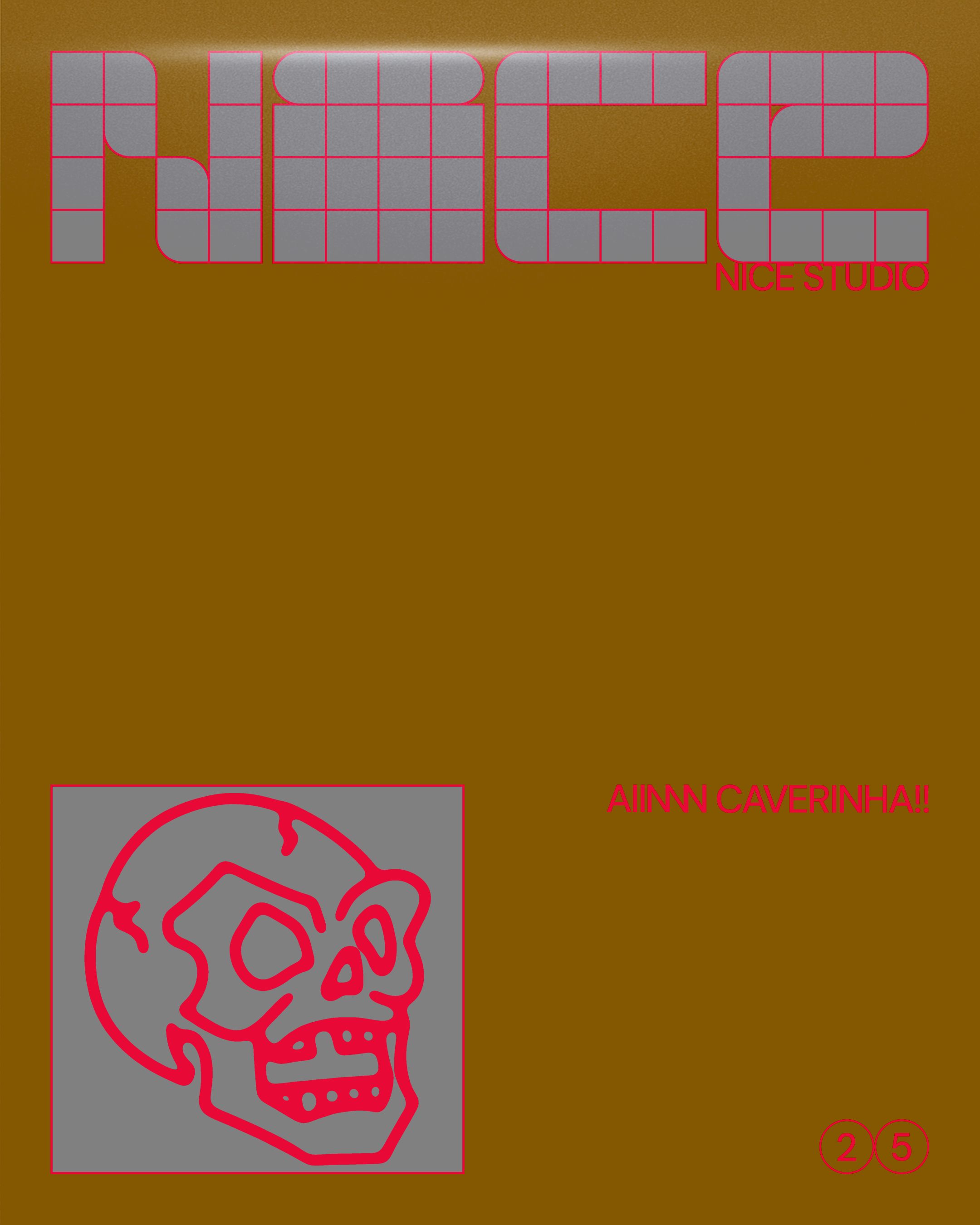
A modular lettering study for Nice Studio, my personal space for visual experimentation. Square units and rounded corners build the word 'Nice', with hot-pink outlines revealing the structure of the gray letterforms against an ochre background. A loose skull drawing brings an expressive counterpoint to the disciplined grid, while generous negative space gives both elements room to stand on their own.


Fit the Mold
Distorted black letterforms stretch and squeeze across a yellow field, resisting the order of a conventional typographic grid. White, hand-drawn marks add another layer of movement. A torn-paper variation shifts the same composition into monochrome, giving 'I never tried to fit the mold' a rougher, more physical presence.


Exit
Classical columns and an arched doorway are rearranged into an impossible structure. Floating fragments and sharp shadows create tension between a recognizable entrance and a space that refuses to behave as expected. Light and inverted versions explore how contrast, grain, and torn-paper textures change the mood of the same architectural image.


Surreal
Illustrated figures twist into the letters of 'Surreal', turning typography into a small cast of characters. Coral, pink, and purple bring warmth to one version, while a lavender-and-white treatment pares the composition back. Loose poses and grainy textures make the word feel animated, even in a static format.