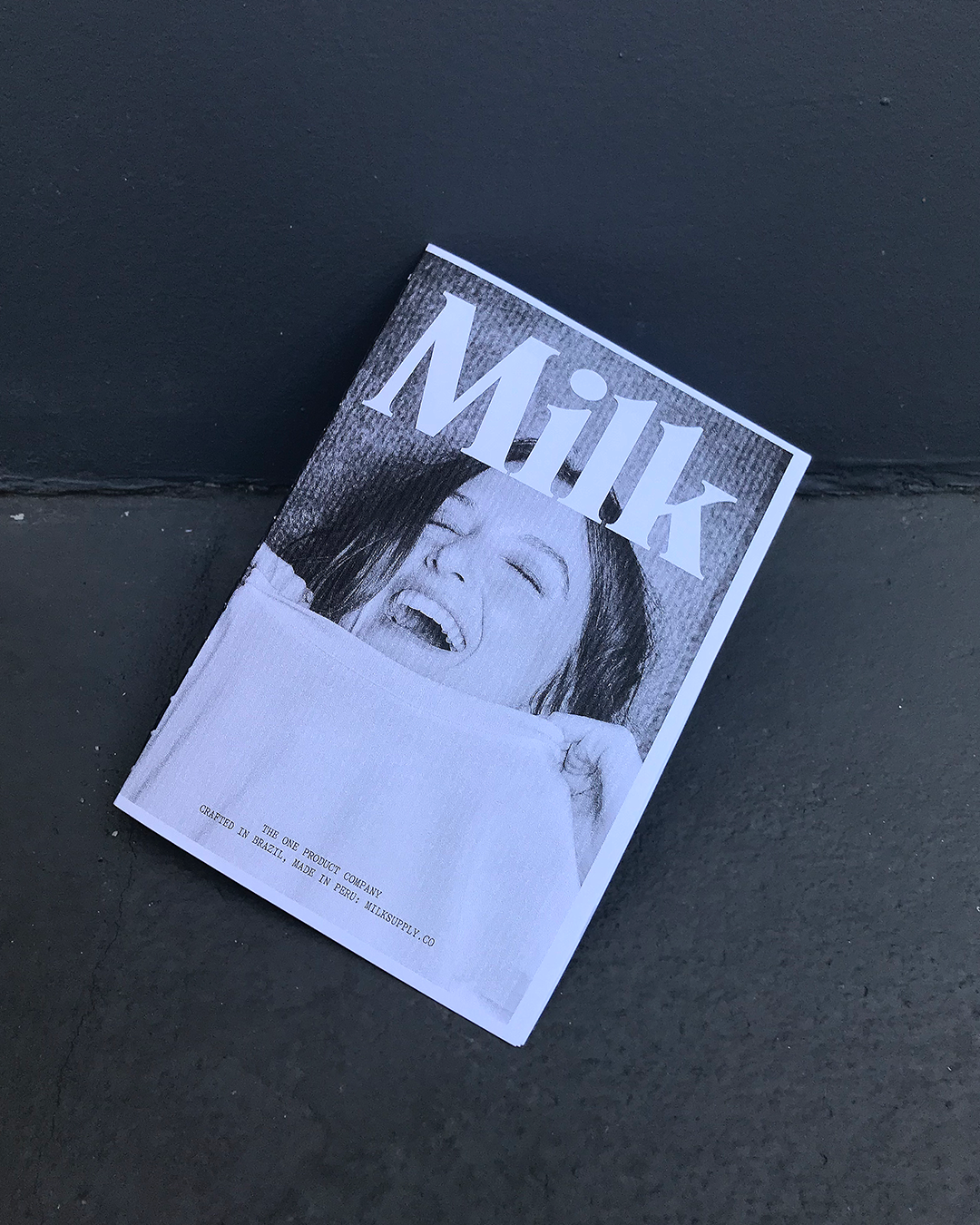
18 Things
Zine for Milk SupplyRole:
Creative Art Directior
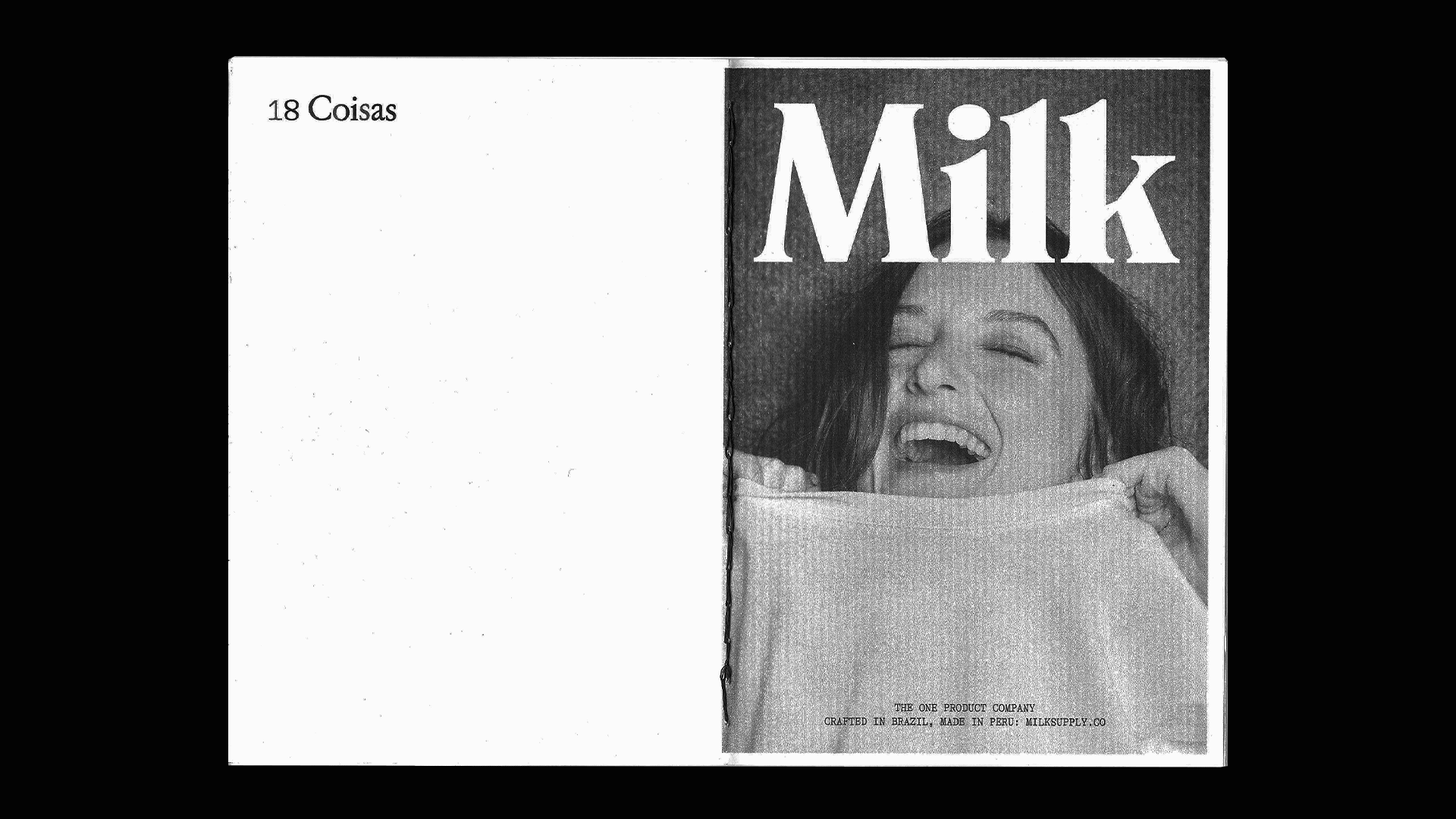
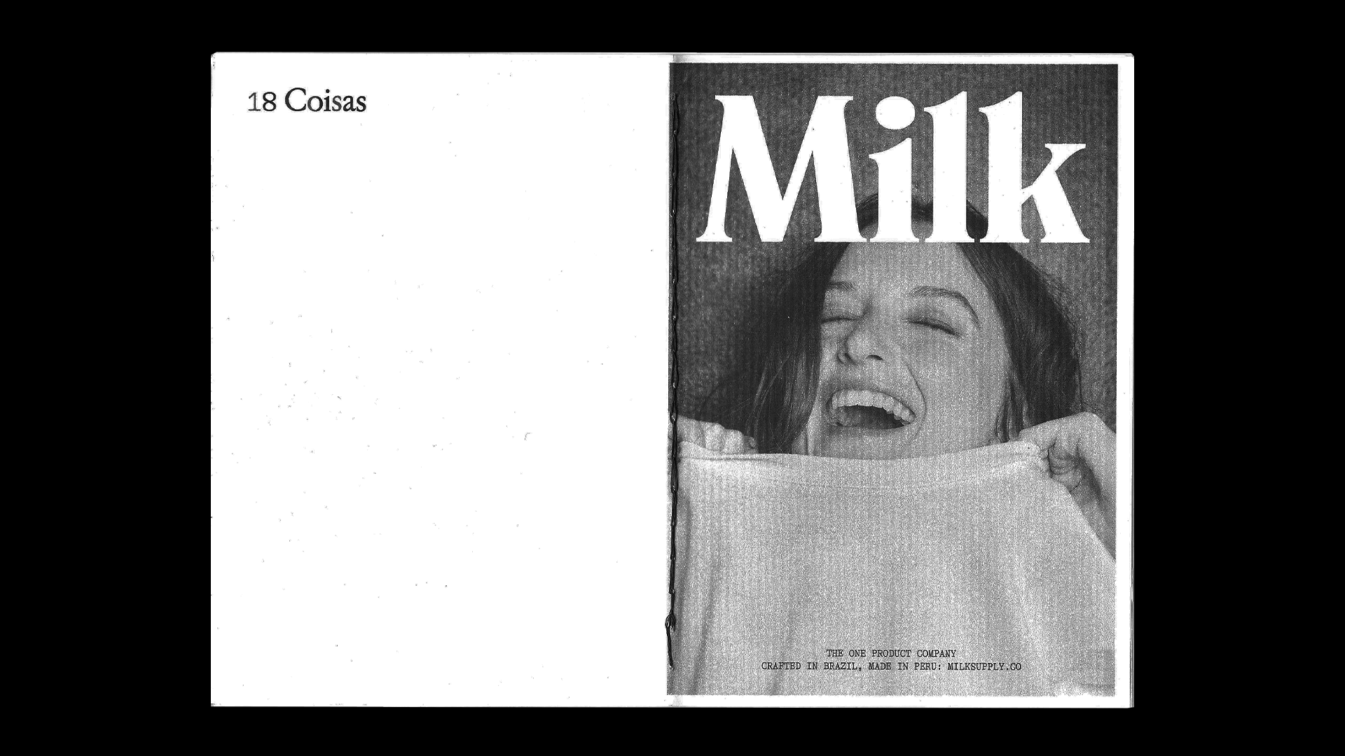
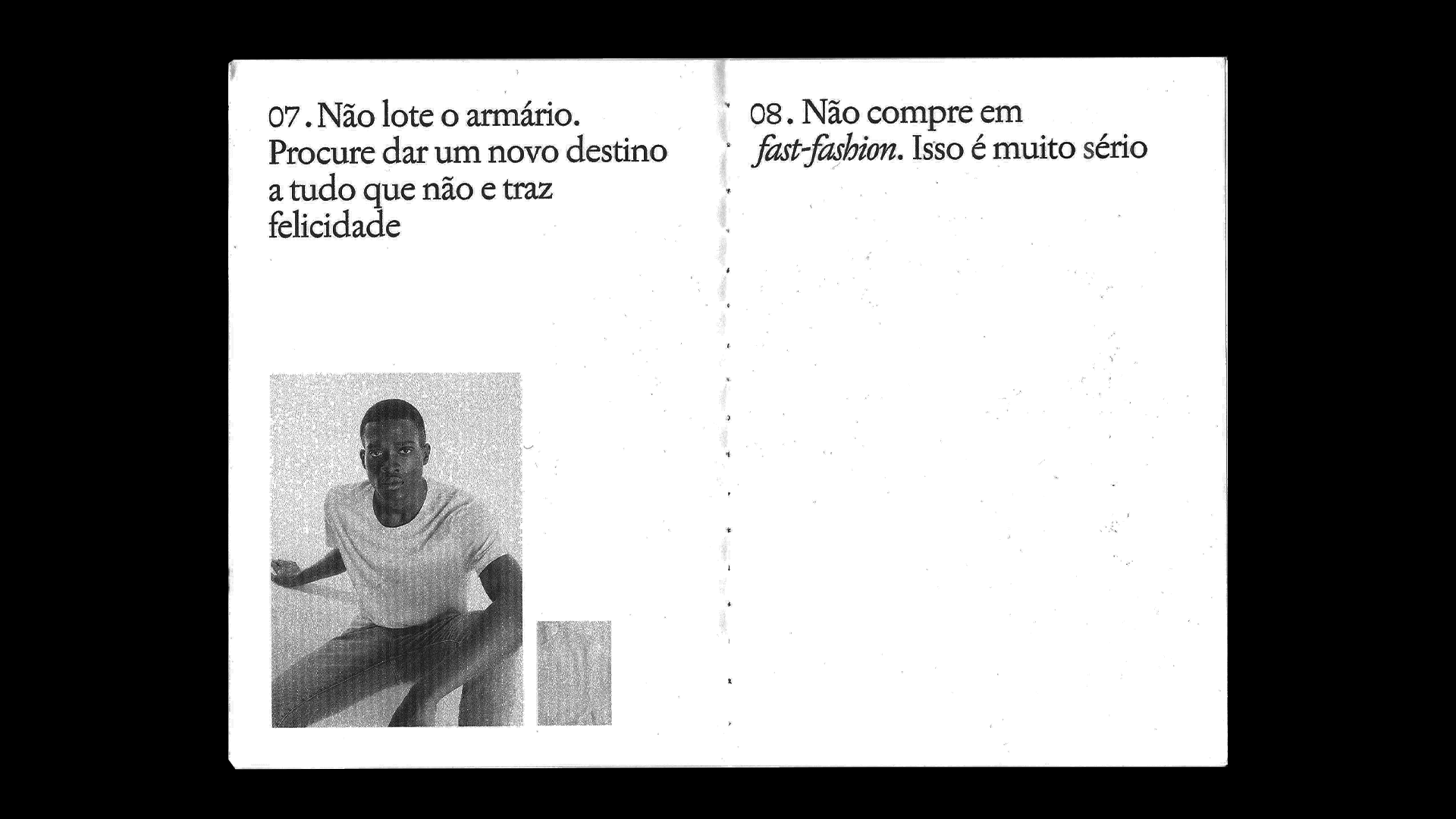
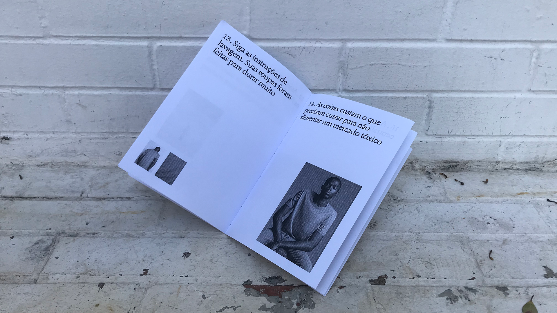
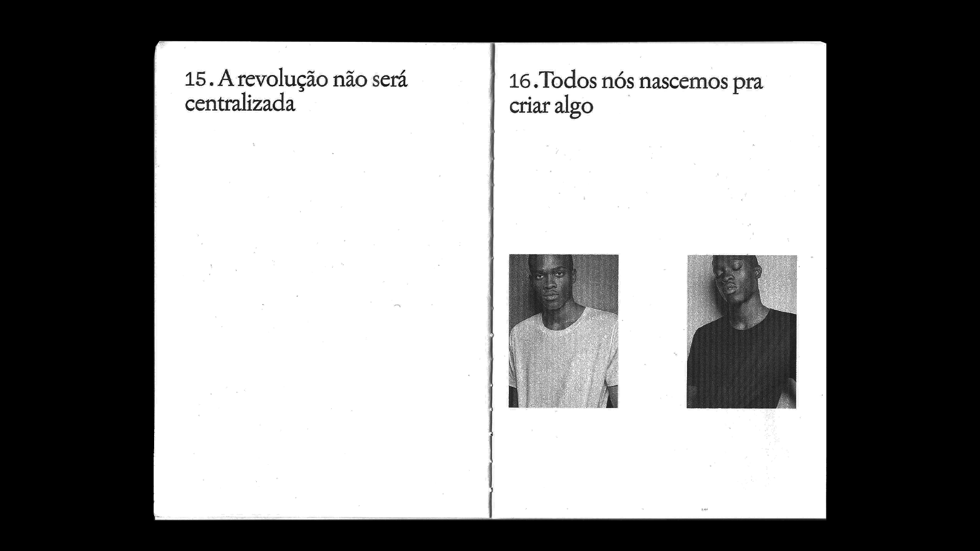
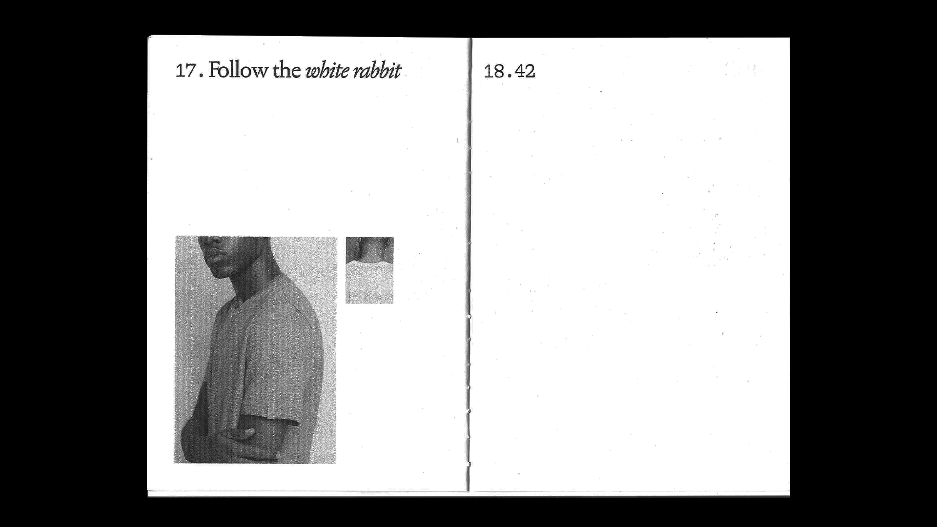
Milk Supply is a minimalist design studio created to reimagine people's relationship with the essentials.
The brand only offers one product: the best t-shirt ever made for the human body. And to communicate better with their consumers, there was an urgency to translate it's aims in a visually-engaging instagram profile that connected on and offline world in a milky perspective.
The brand only offers one product: the best t-shirt ever made for the human body. And to communicate better with their consumers, there was an urgency to translate it's aims in a visually-engaging instagram profile that connected on and offline world in a milky perspective.


Art Director: Lucas Ramos
Copywriter: Caio Milanesi
Approved by: Rafael Caldeira and Gui Caldeira
Brand Identity: Porto Rocha
Copywriter: Caio Milanesi
Approved by: Rafael Caldeira and Gui Caldeira
Brand Identity: Porto Rocha
Creative Art Director & Designer
Creative Art Director & Designer